Kylan Zastrow
Graphic Artist - Web Designer
Graphic Artist - Web Designer

My name is Kylan Zastrow and I am a graduate of the Saskatchewan Polytechnic Graphic Communications program. My specialties in the field are Adobe InDesign and website development with HTML, CSS, basic Bootstrap and Wordpress. I am also fluent in Adobe Illustrator and Adobe Photoshop. I also have experience in photography, more specifically for product shots and with writing.
Graphic Communications Diploma
2021 | Awarded with Distinction
Create a logo and complimentary design piece for a specific client.
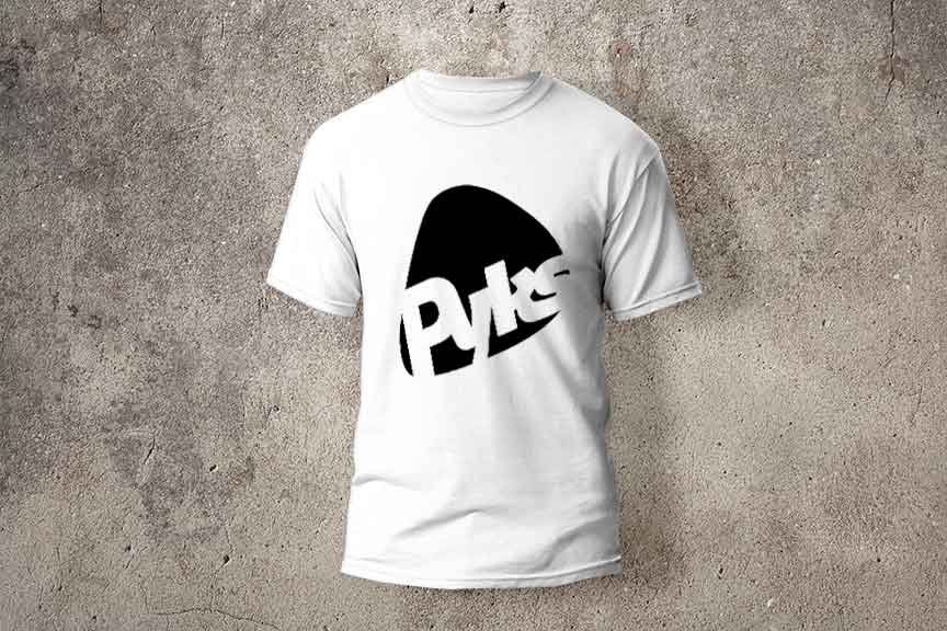
This was one of the first creative performance assessments I had when I started in my Graphic Communications Program. Despite this being my first ever creative assignment, I am still very proud of these works, specifically the
logo.
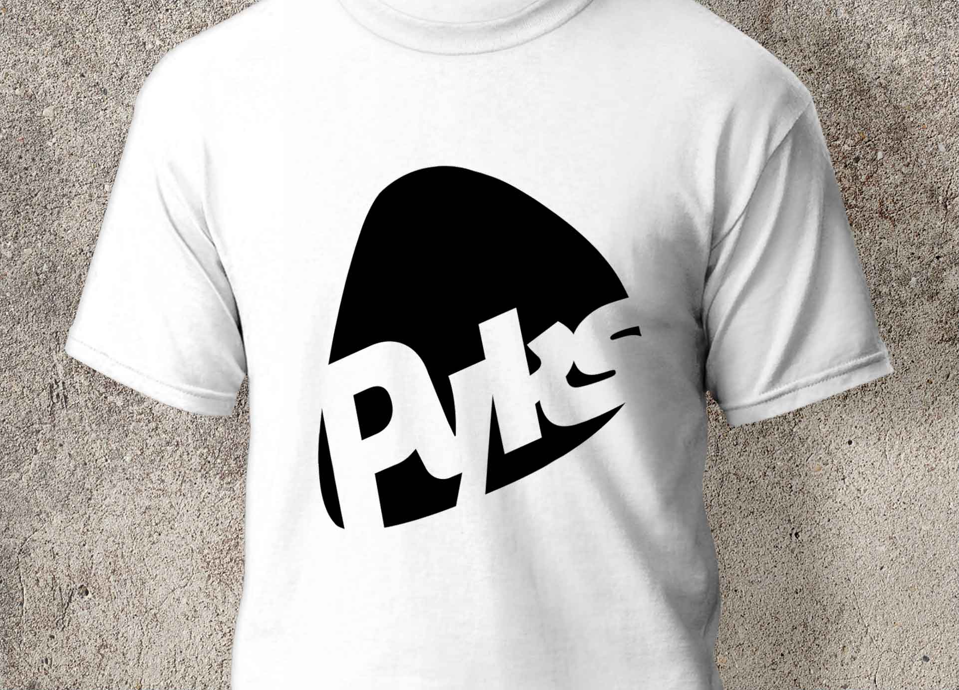
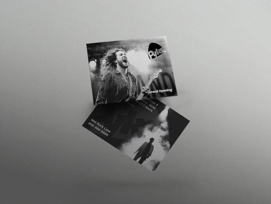
We had to select one of four options for companies with specific needs. I chose the "Recording Studio" option, which had the restriction of everything in black and white to save money. I had to design a logo and a promotional
pierce card placed at checkout counters at different music stores.
Mockup Attributes
Mockup psd created by Vectorium - www.freepik.com
Business card psd created by BiZkettE1 - www.freepik.com
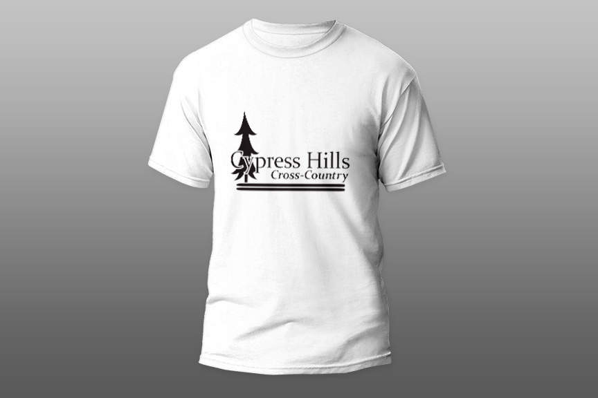
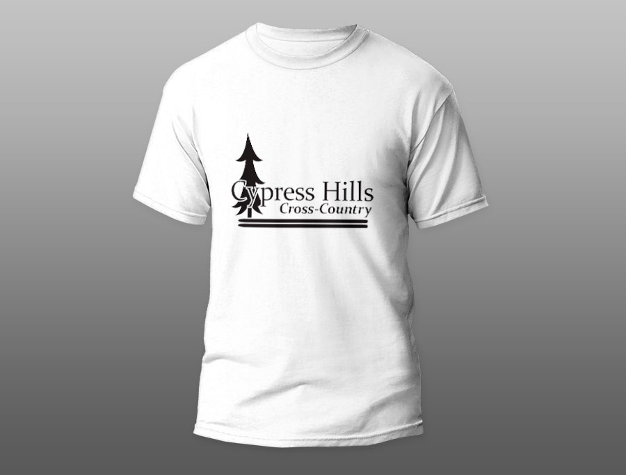
We had to create a logo for a winter-themed activity, then print it on vinyl and on a t-shirt (I still have the t-shirt that I printed, while the vinyl has been removed from the window that I had to put it up
on)
This was the logo I created and a picture of my t-shirt I printed.
Mockup Attributes
Shirt psd created by Vectorium - www.freepik.com
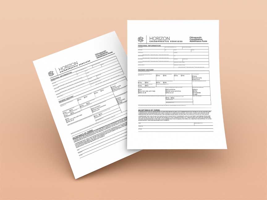
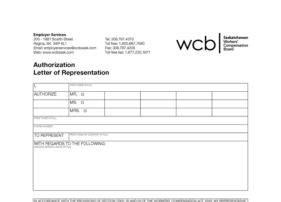
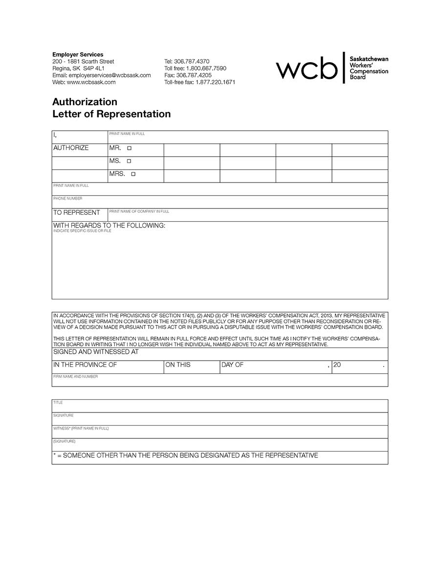
We were given an improperly designed form to recreate using a table in InDesign.
Mockup Attributes
Business psd created by xvector - www.freepik.com
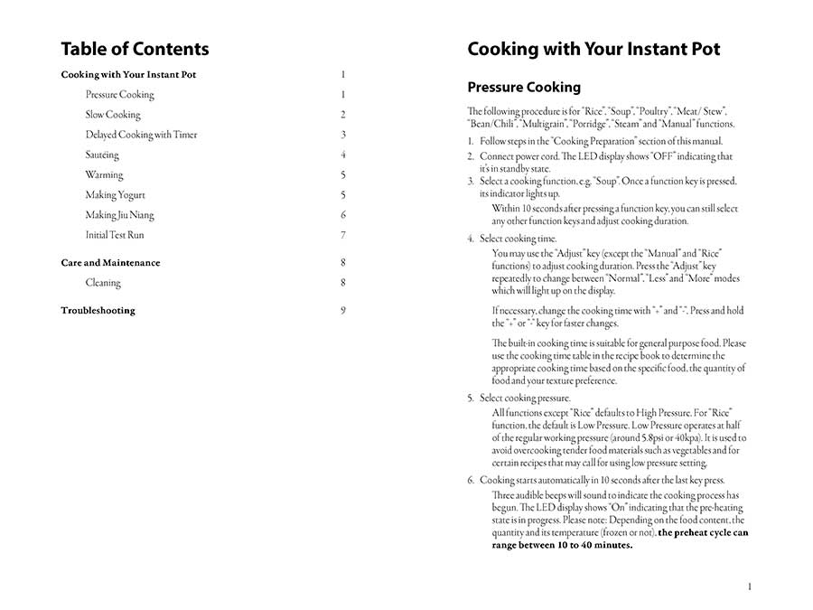
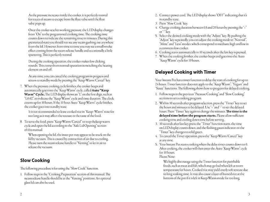
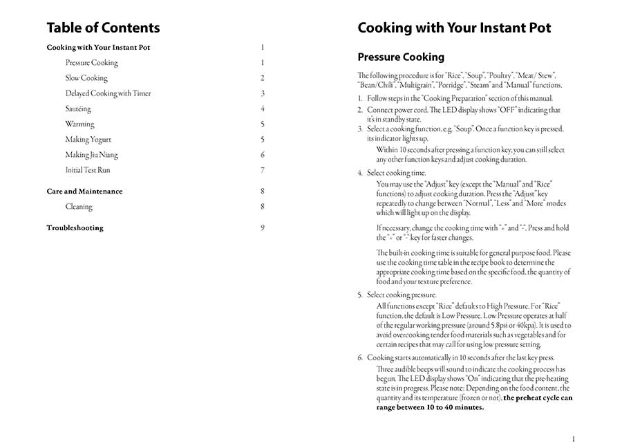
We were supplied text and the cover pages for this Instant Pot Cooking Guide and had to follow the following instructions for development:
- Page 1 and 12 must be the cover.
- Page 2 must have the table of contacts with accurate page numbers for reference.
- All text must be in one flowing text box from pages 2-11, and pages 3-11 must be numbered.
- No double spaces or double returns.
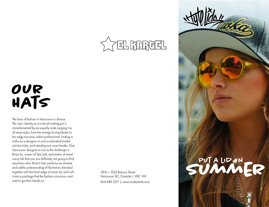
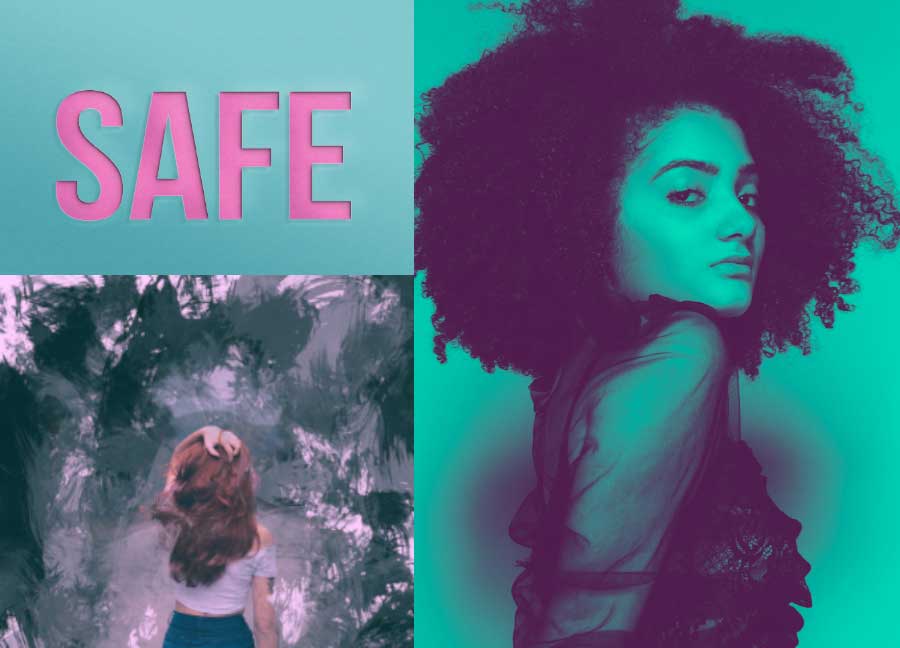
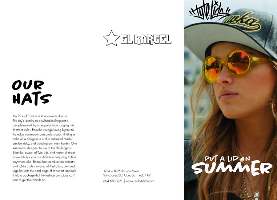
Given supplied images, text and logo, we had to create a brochure. This one would fold into a Z-Fold brochure when you put it together.
We needed to create a four-panel brochure with supplied text and logos (we searched for our images online).
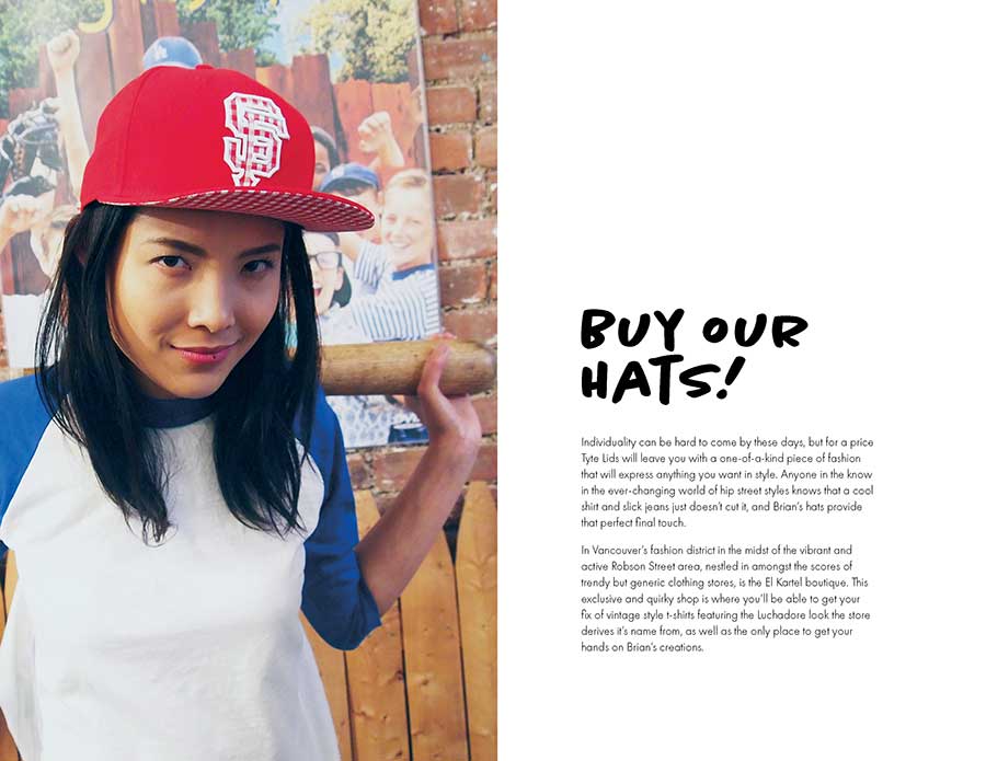
We have to include three images from the supplied set, one from each category supplied. (Instruments, Musicians/Models and Textures)
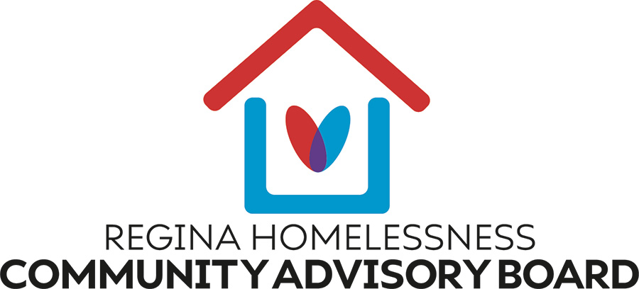
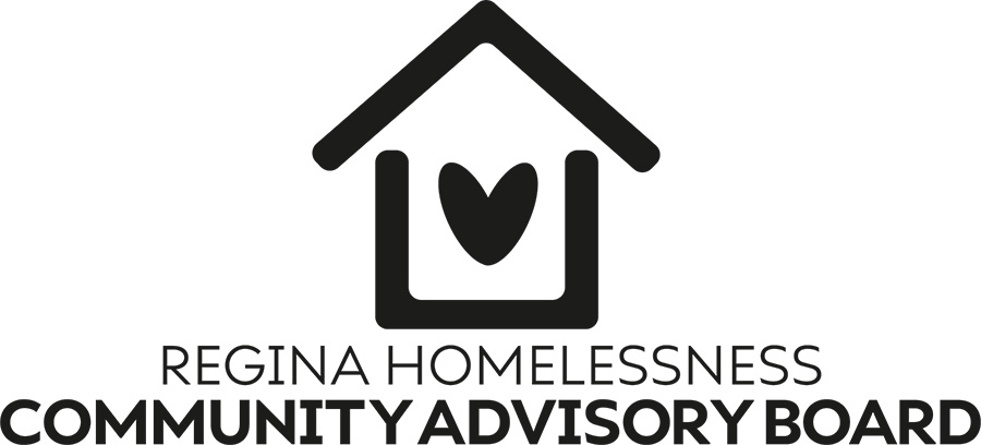
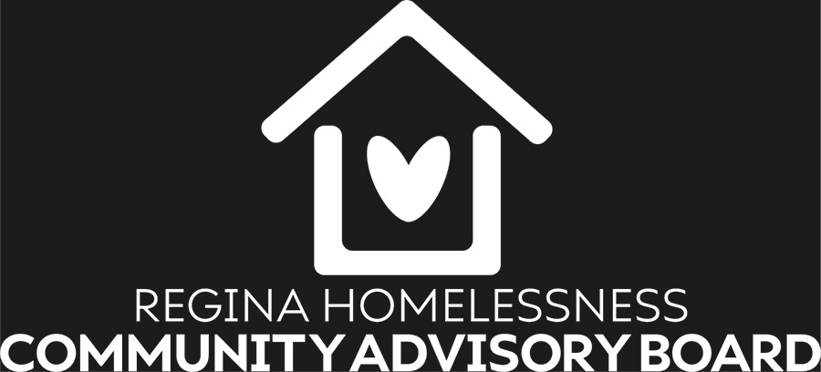
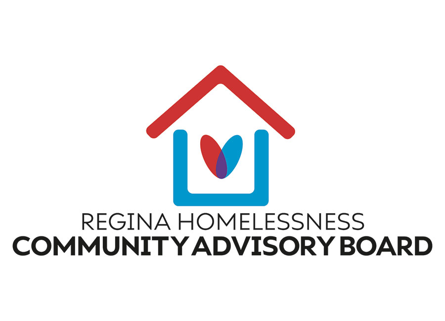
We had to create a logo for the Regina Homelessness Community Advisory Board. We had to make the CMYK, black and white versions.
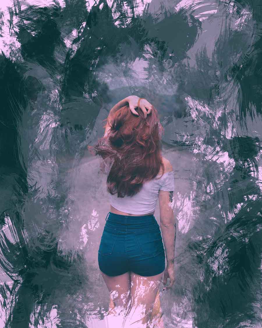
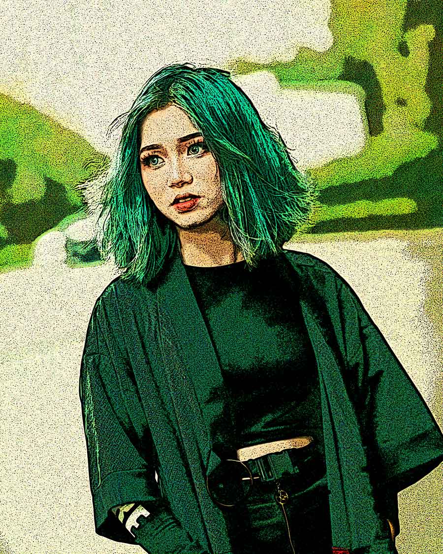
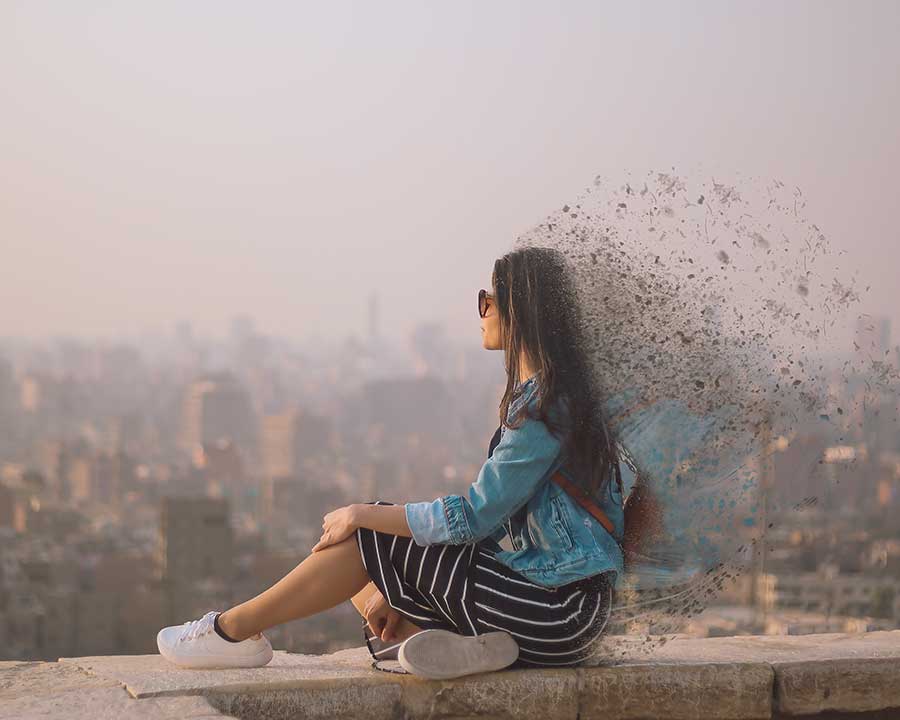
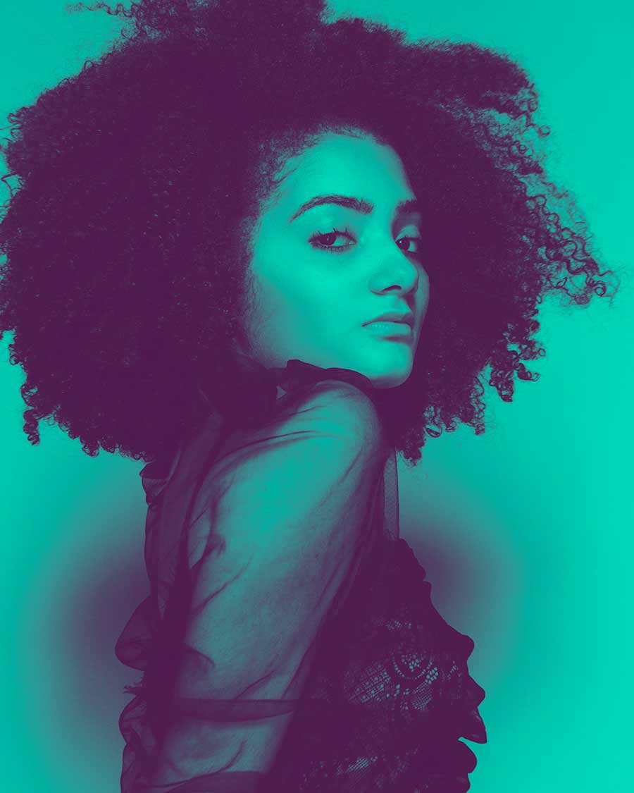
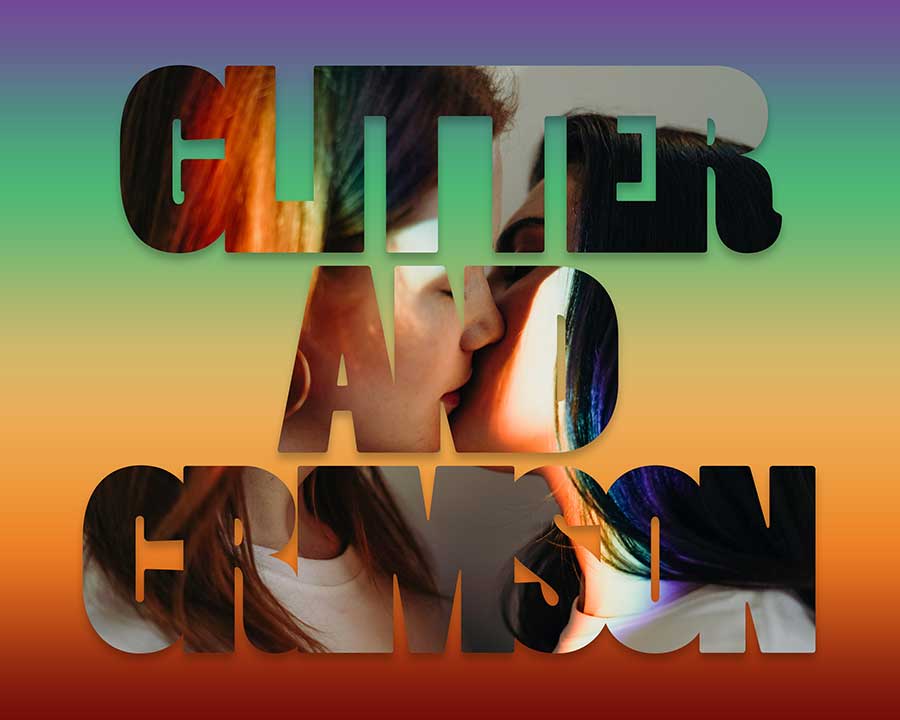
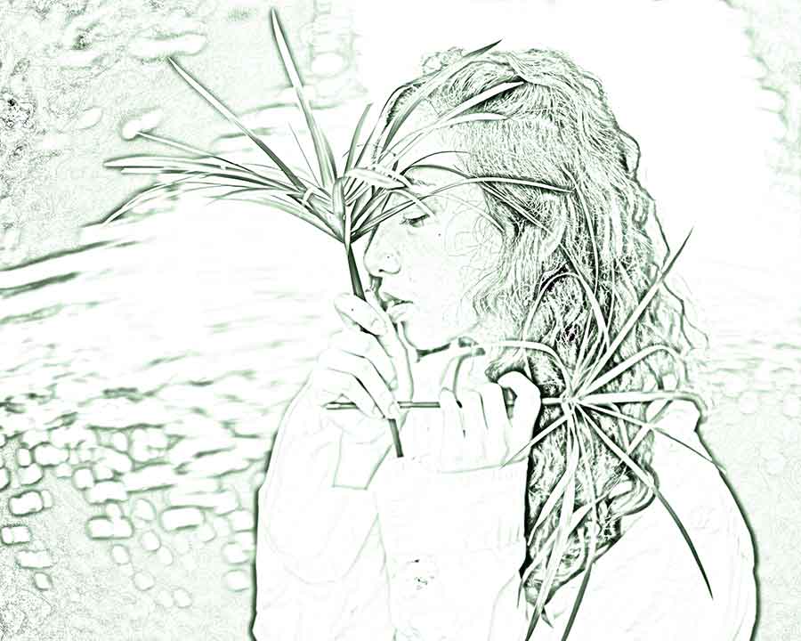
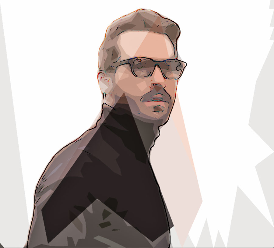
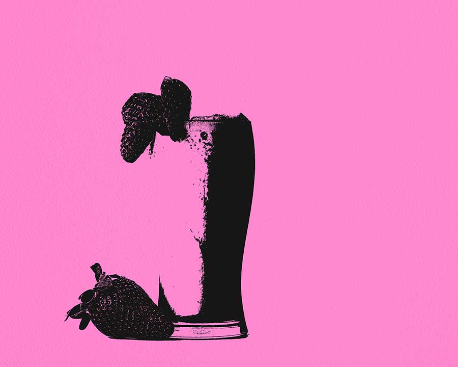
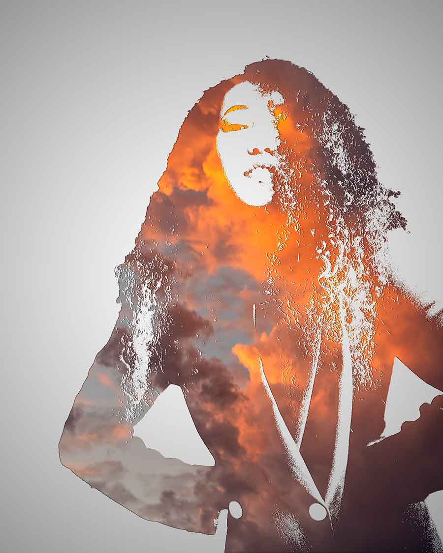
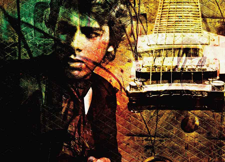
This is a series of designs I created during my Image Editing 3 course. Our instructor had us follow photoshop tutorials to create our versions of each of these photoshop effects.
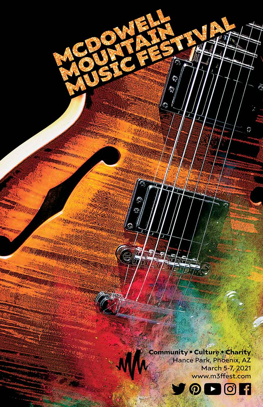
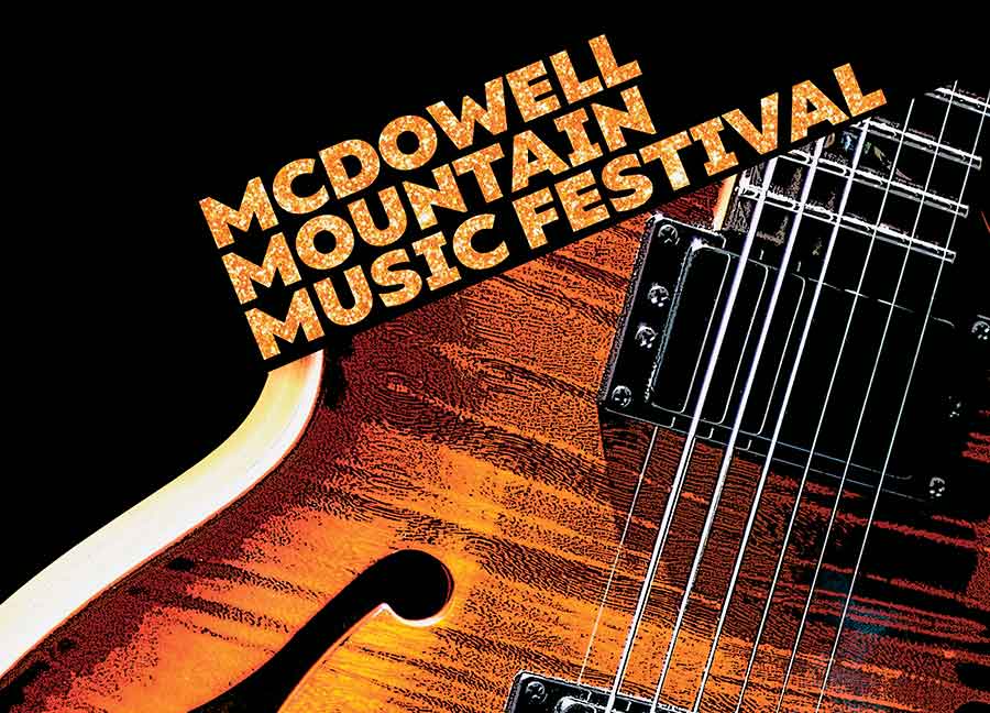
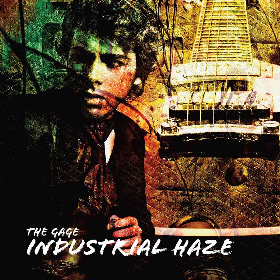
We needed to create a poster for M3F, which is the McDowell Mountain Music Festival. We had to use creative image and text effects and include supplied text and logos.
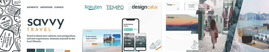
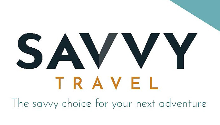
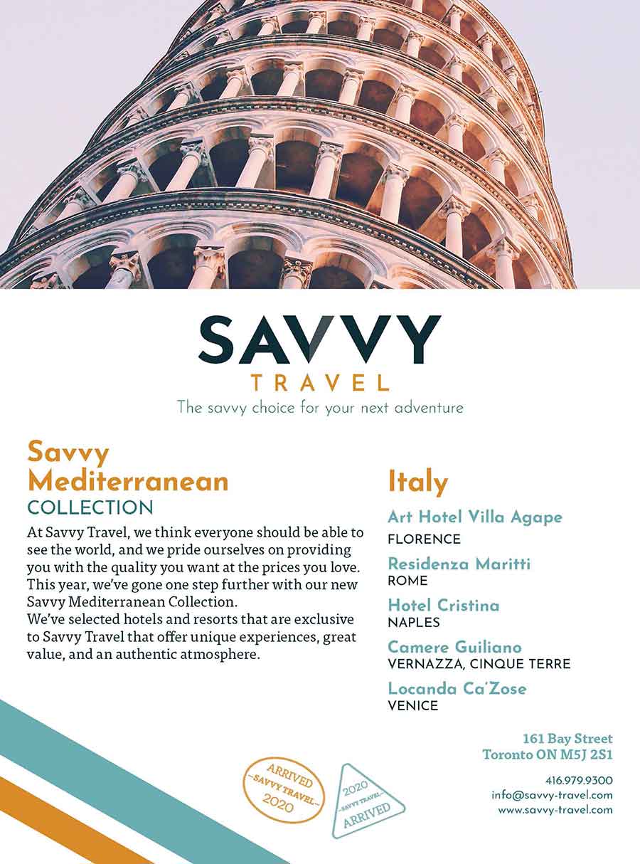
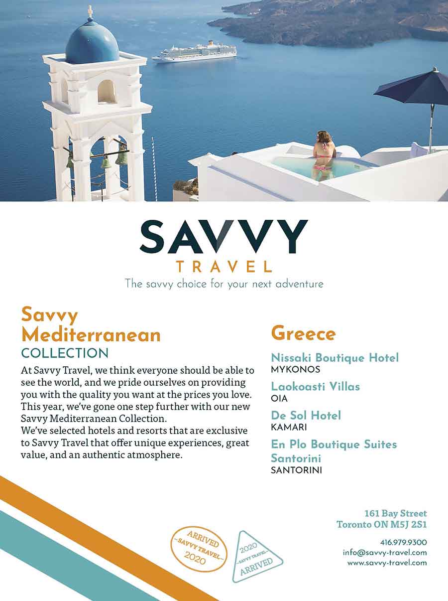
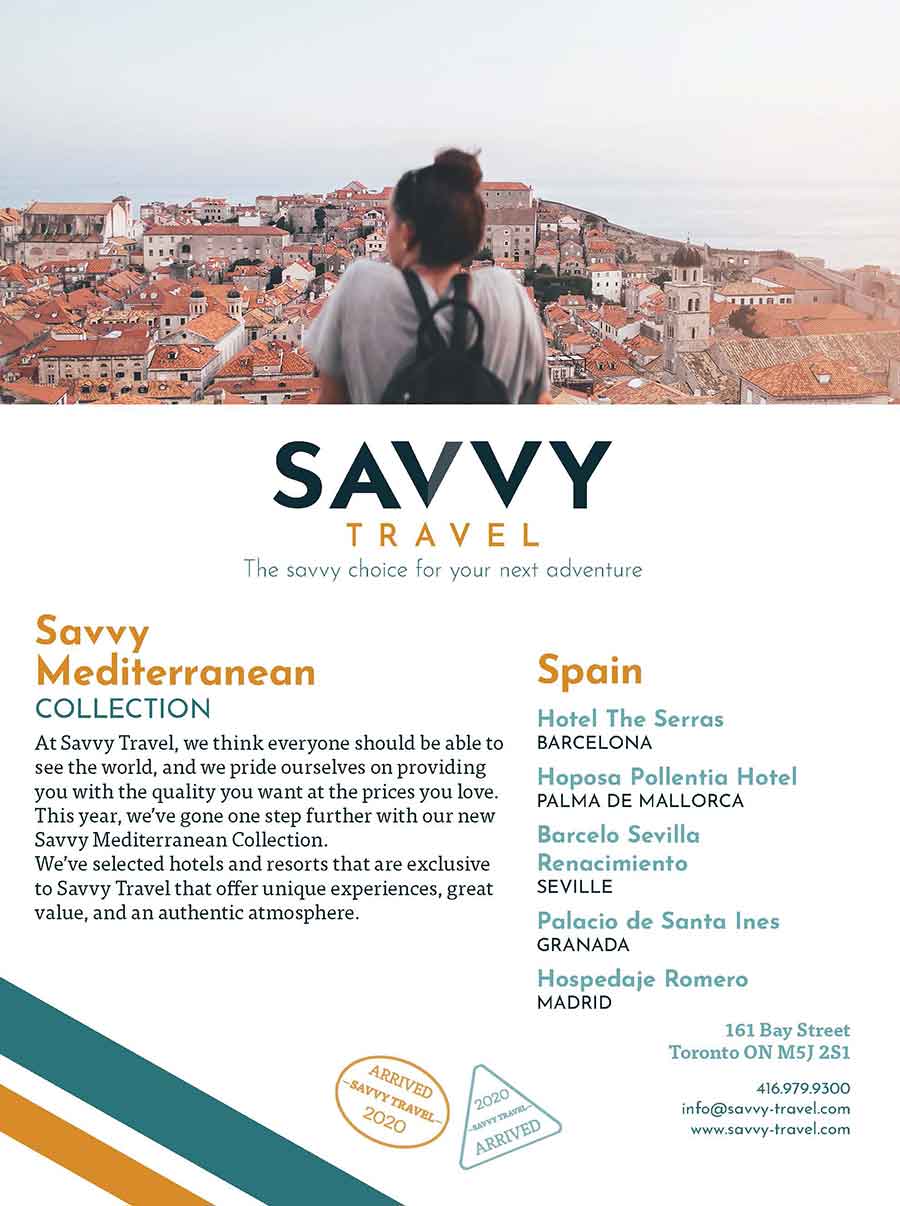
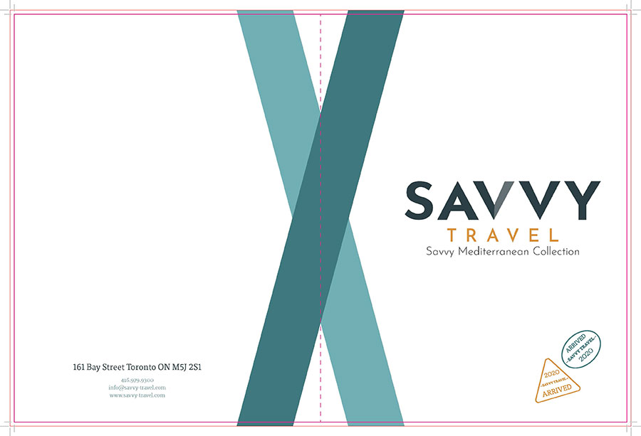
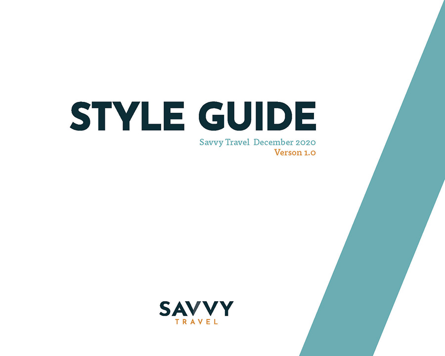
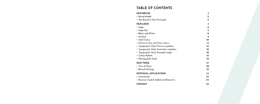
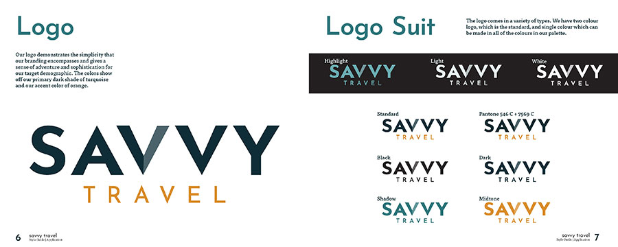
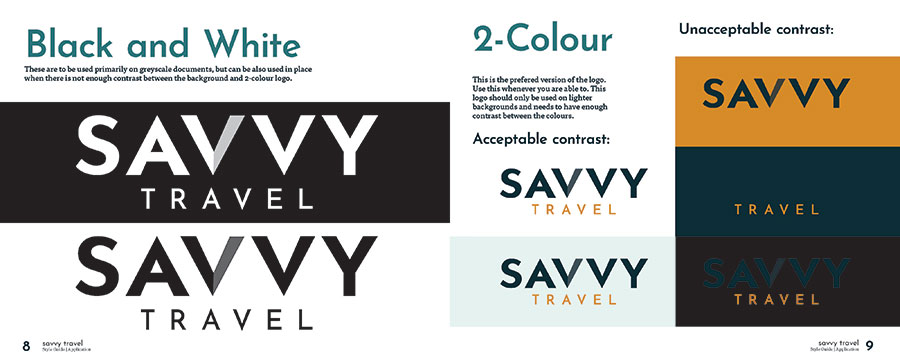
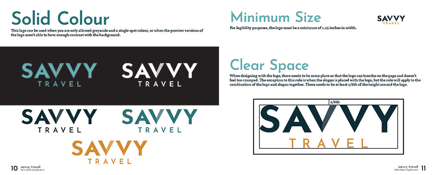
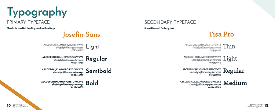
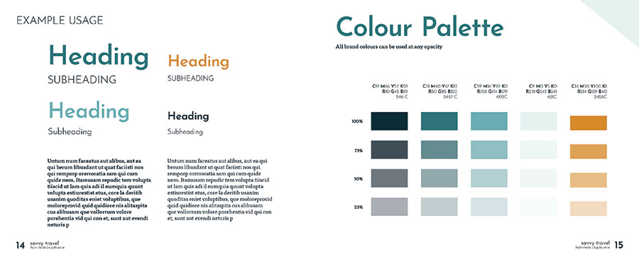
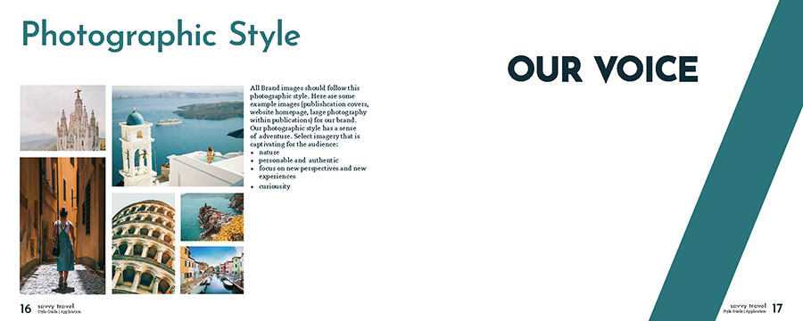
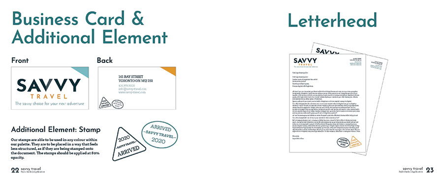
This was a two-month group project that our class took within two of our courses. We had to rebrand a company called Savvy Travel. This travel company wanted to sell its services to people interested in seeing the
local aspects of travel instead of visiting tourist locations. My group was a total of three people, including myself.
This assignment included the following projects:
- Stylescape (Collaboration)
- Logo (CMYK, RGB, SPOT, Black, White) (Collaboration)
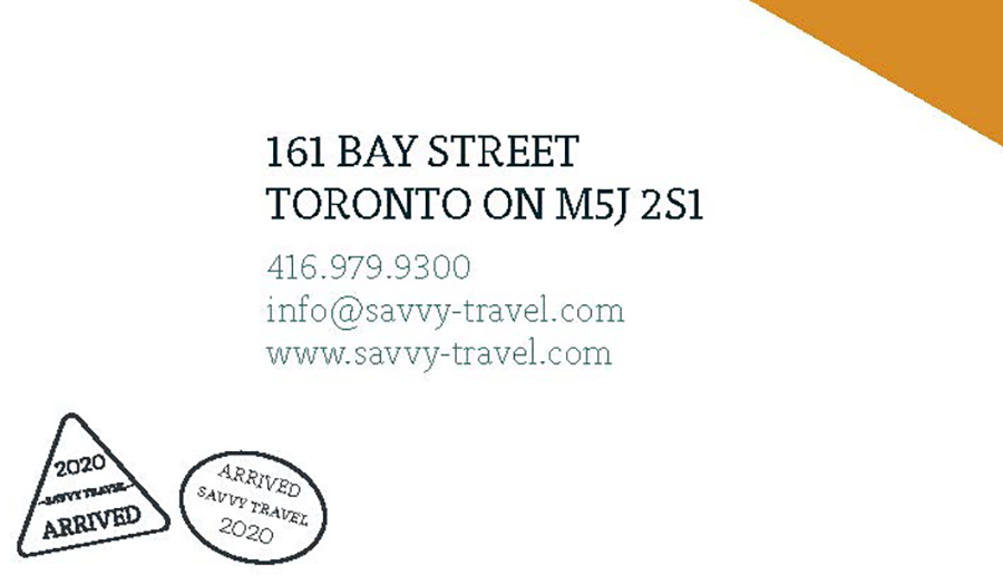
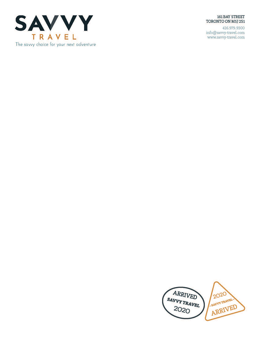
- Stationary (Business Cards, Envelope, Letterhead) (Created by different group member)
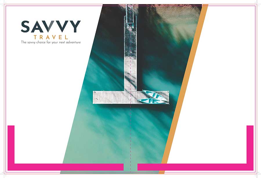
- Flyers (Created by myself)
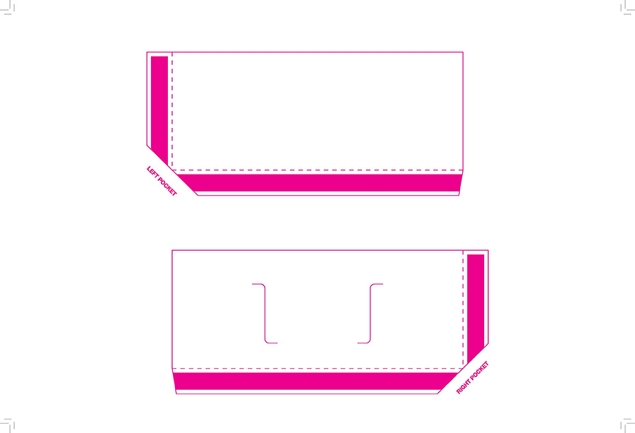
- Pocket Folder (Created by different group member)
- Style Guide (Collaboration)
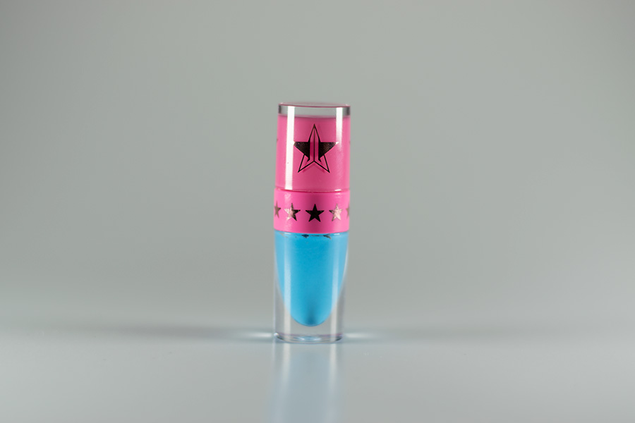
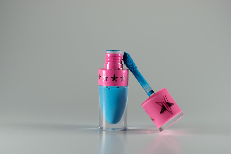
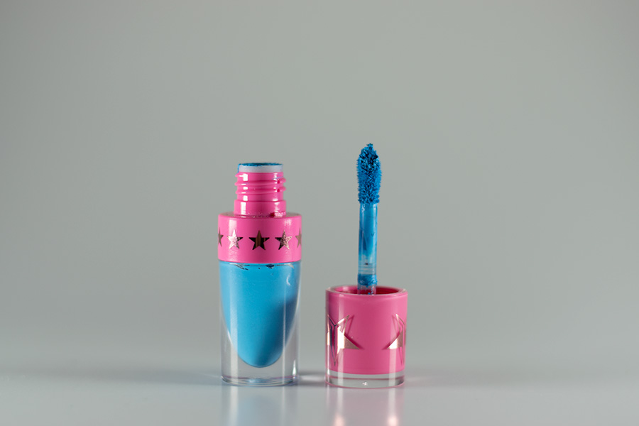
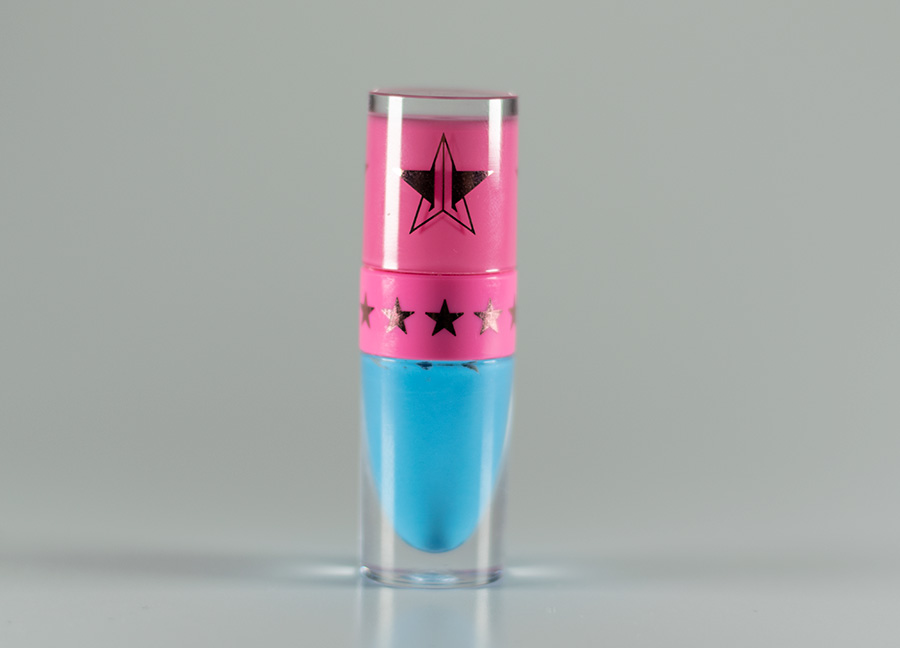
This assignment was our first time taking product shots. Due to Covid-19 quarantine, the supplies I used were a white piece of paper and cheaper and smaller lights instead of studio lights. Due to that fact, there was
leniency in what was acceptable with our shots, but we were able to develop the skills to take them with professional tools.
We had to take three images of the same item from the camera's exact location in different poses of the product.
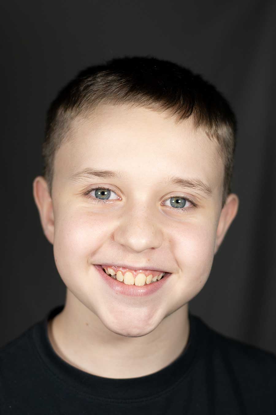
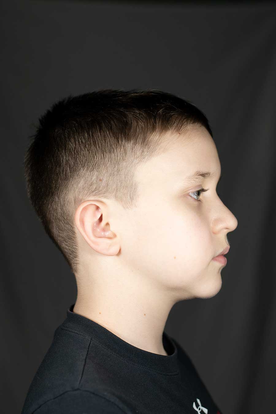
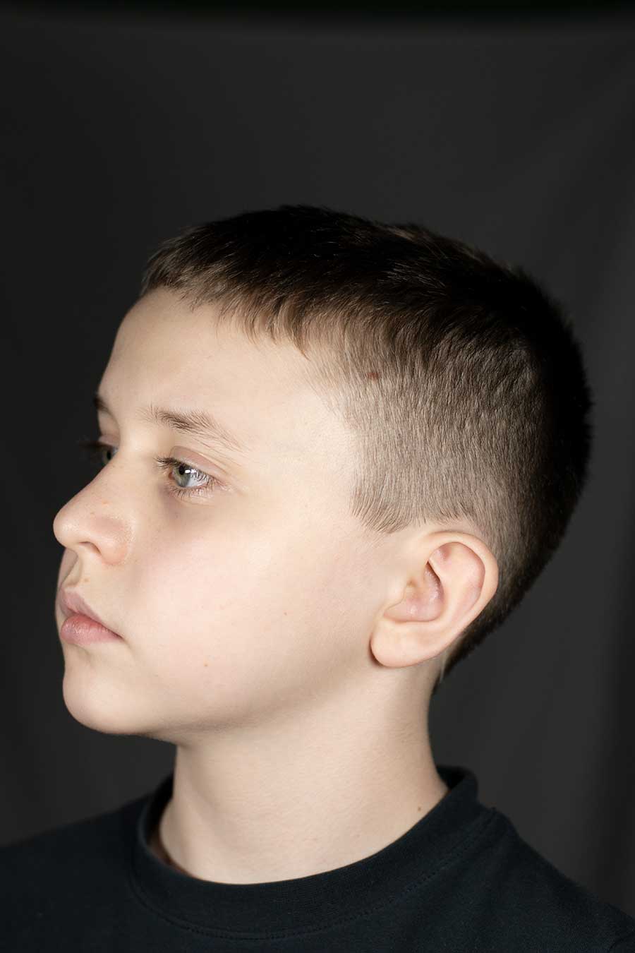
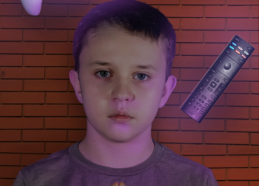
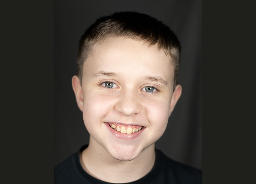
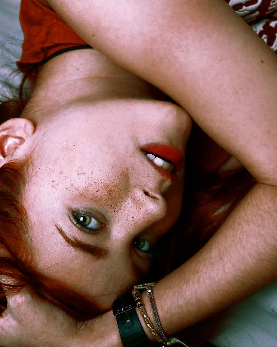
This assignment was our first time taking portrait shots. Due to Covid-19 quarantine, the supplies I used were a white piece of paper and cheaper and smaller lights instead of studio lights. Due to that fact, there was
leniency in what was acceptable with our shots, but we were able to develop the skills to take them with professional tools.
We had to take three images of the same person from the camera's exact location in different poses of the model. I used my younger brother for this assignment.
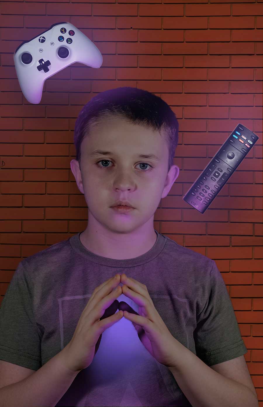
With the skills we learnt in our basic portrait assignment, we were to take a portrait shot and product shots (as well as background if you were able to take a picture of the background you wanted) to create a Photoshop composition of your choice. All images needed to be perfectly in focus and sharp without any blurring. We had complete creative freedom passed those restrictions.
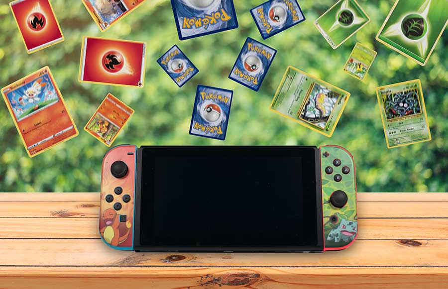
With the skills we learnt in our basic product shot assignment, we were to take product shots (as well as background if you were able to take a picture of the background you wanted) to create a Photoshop composition of your choice. All images needed to be perfectly in focus and sharp without any blurring. We had complete creative freedom passed those restrictions.

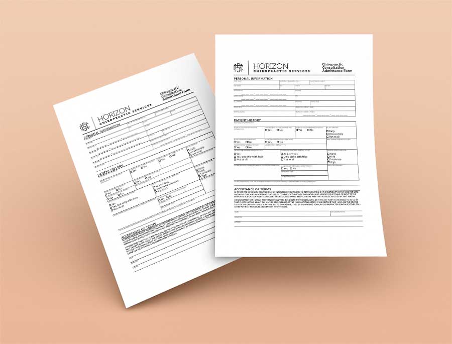
These forms were from our third tornado project. What a tornado project is, is when we are given an assignment for a fake client and need to complete the assignment in a short amount of time.
This assignment was to be completed in two hours. We were given original InDesign files with what style their forms are, and you had to update two more to look the same.
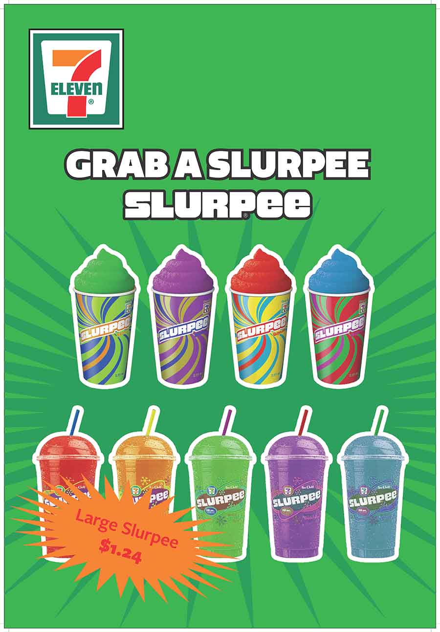

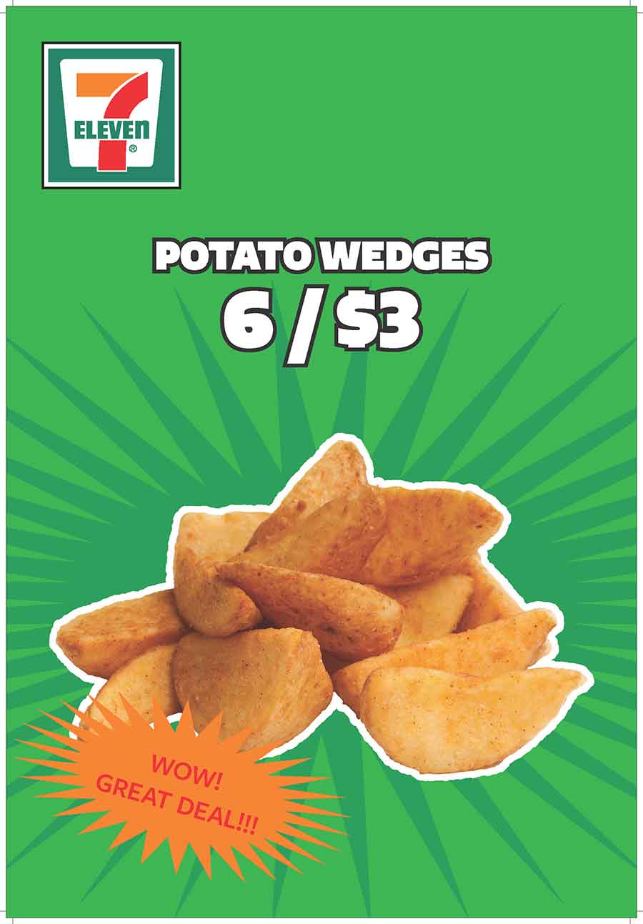
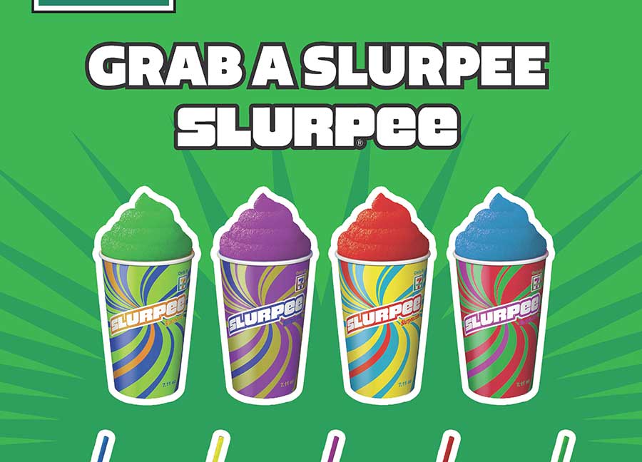
These posters were from our fourth tornado project. What a tornado project is, is when we are given an assignment for a fake client and need to complete the assignment in a short amount of time.
For this assignment, we had to make three posters for 7 Eleven, following their style guide and having all of the necessary supplied images and text. The client provided us with the pictures that they wanted us to use as well. All
of the posters needed to be cohesive as well.
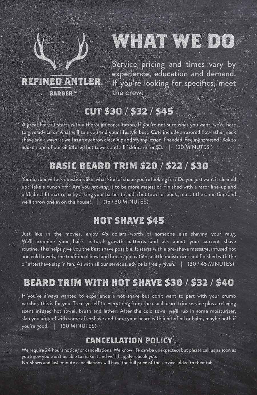
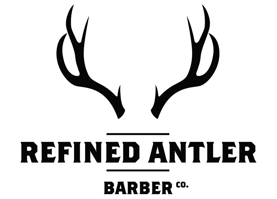
This was one of two major projects we had for this class, where we were given a company, a stylescape and a few items to create for the company and a brand new logo. They supplied up solely with the stylescape (which
contained their fonts and palette for each assignment) and the text and display images.
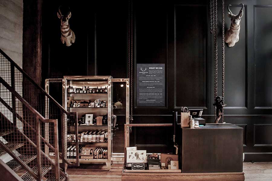
This assignment was for a barber shop called Refined Antler. We had to create the following items:
- Logos
- Pricing Signage
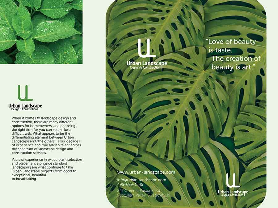
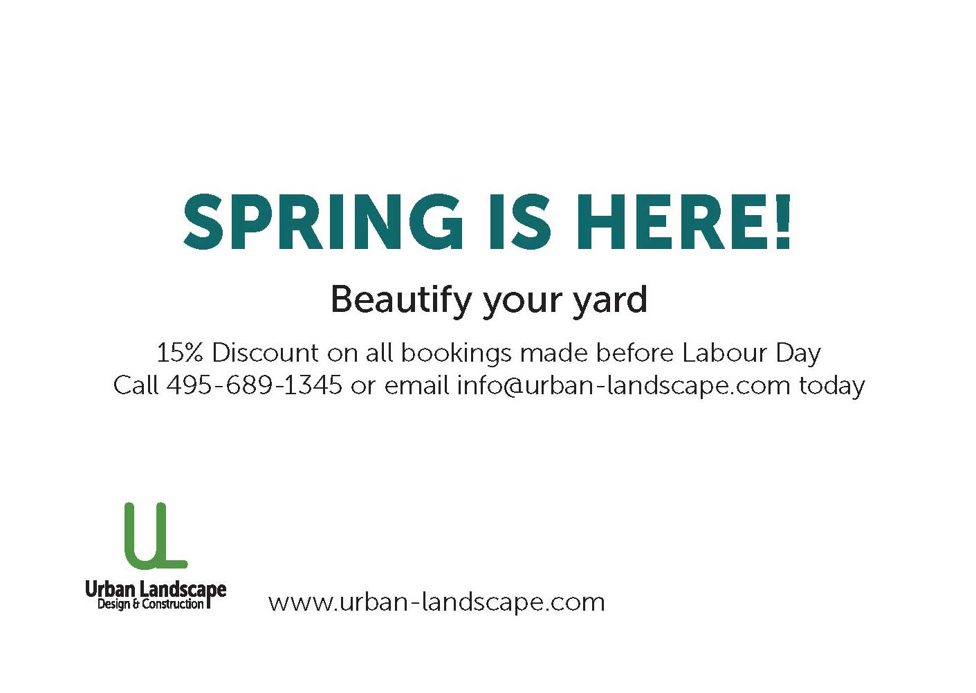
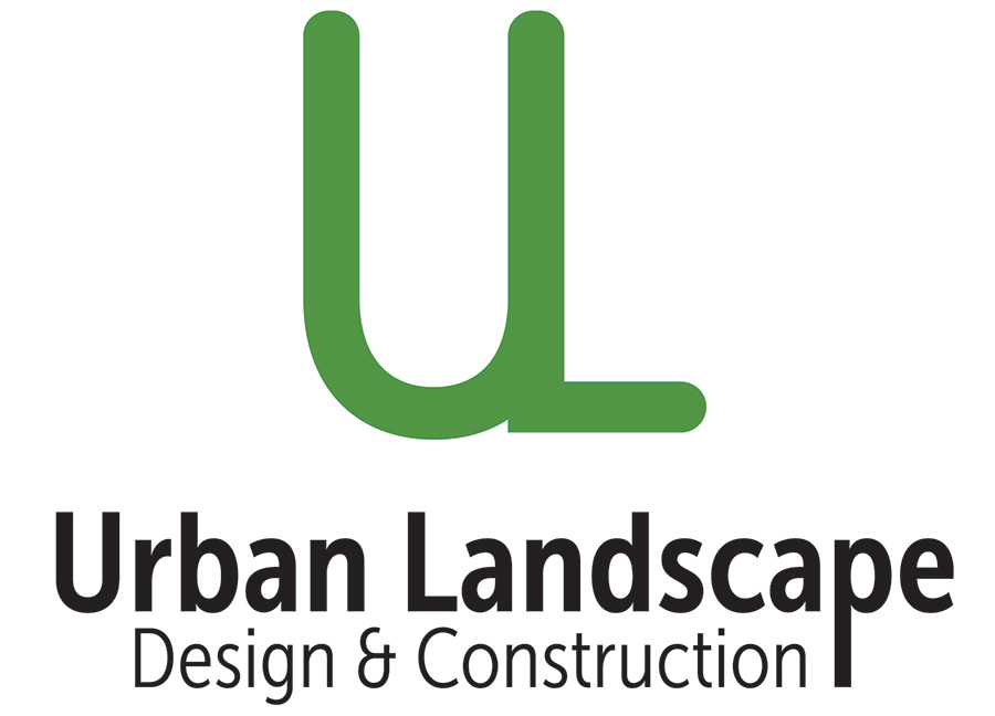
This was one of two major projects we had for this class, where we were given a company, a stylescape and a few items to create for the company and a brand new logo. They supplied up solely with the stylescape (which
contained their fonts and palette for each assignment) and the text and display images.
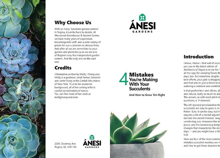
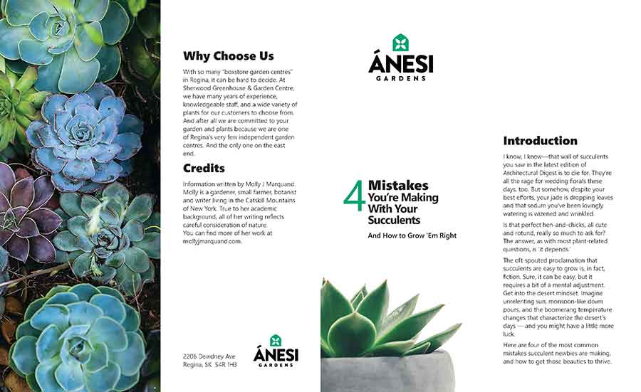
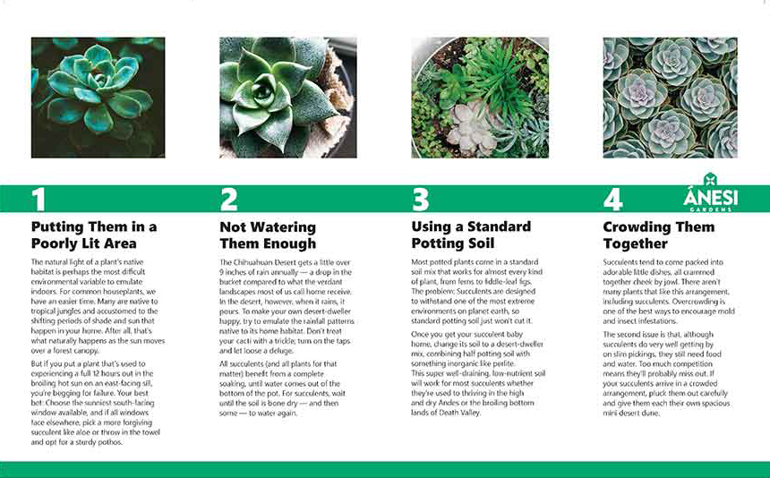
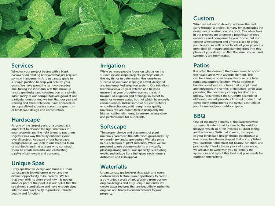
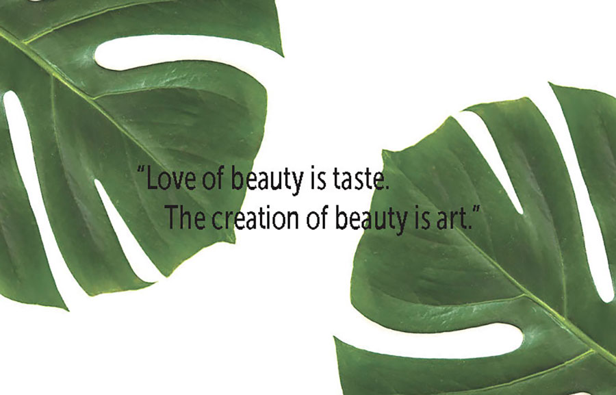
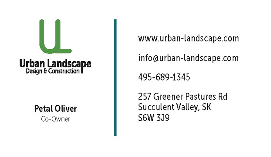
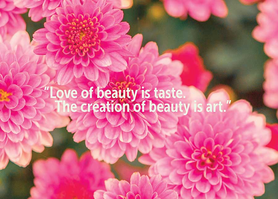
This assignment was for a landscaping company called Urban Landscape. We had to create the following items:
- Logos
- Brochure
- Business Cards (there were eight different names to make. I will only be including one of the eight business cards)
- Postcards
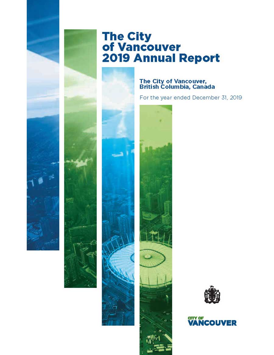
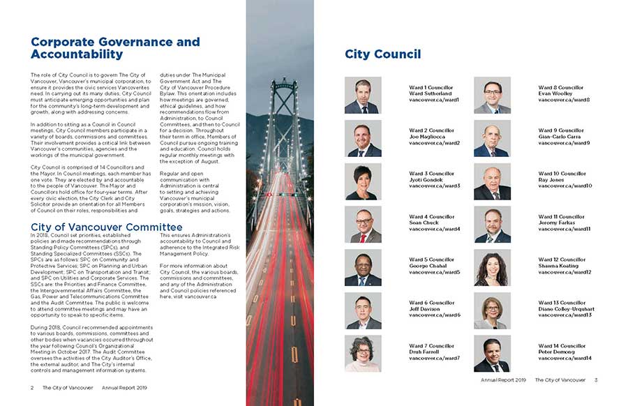
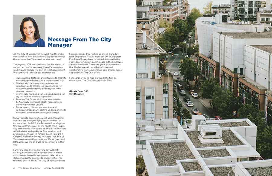
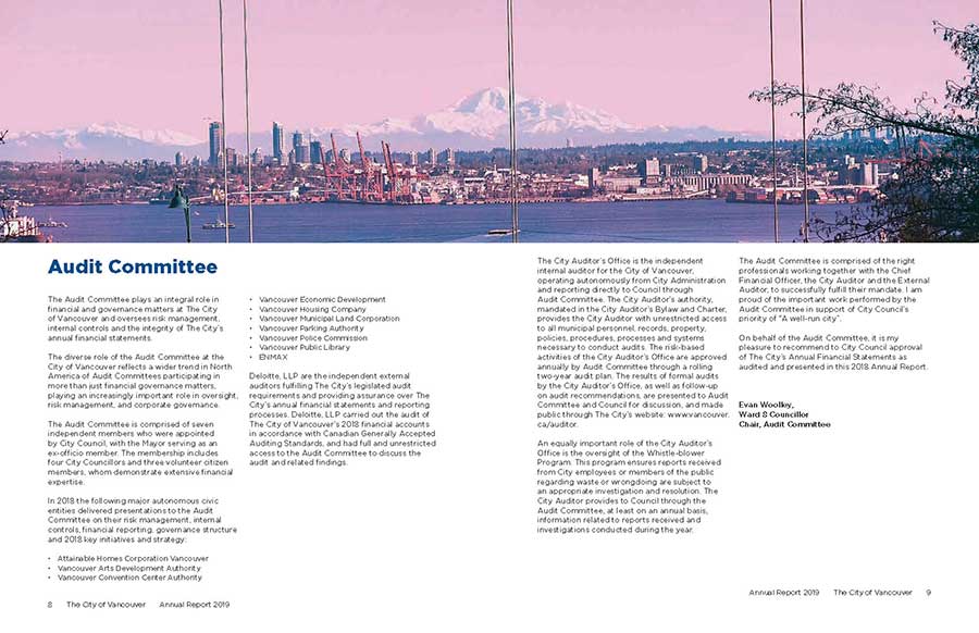
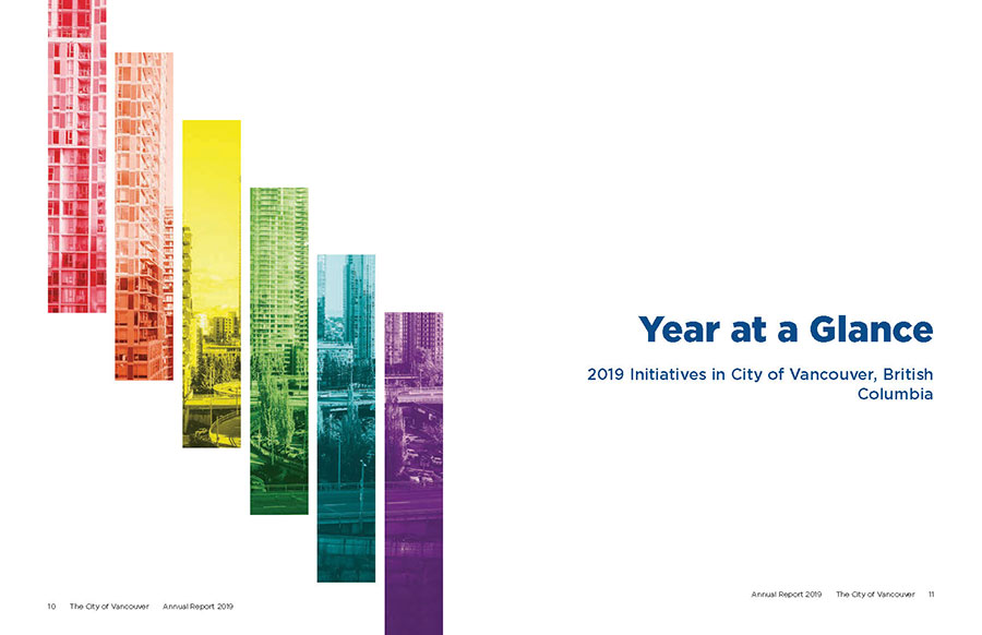
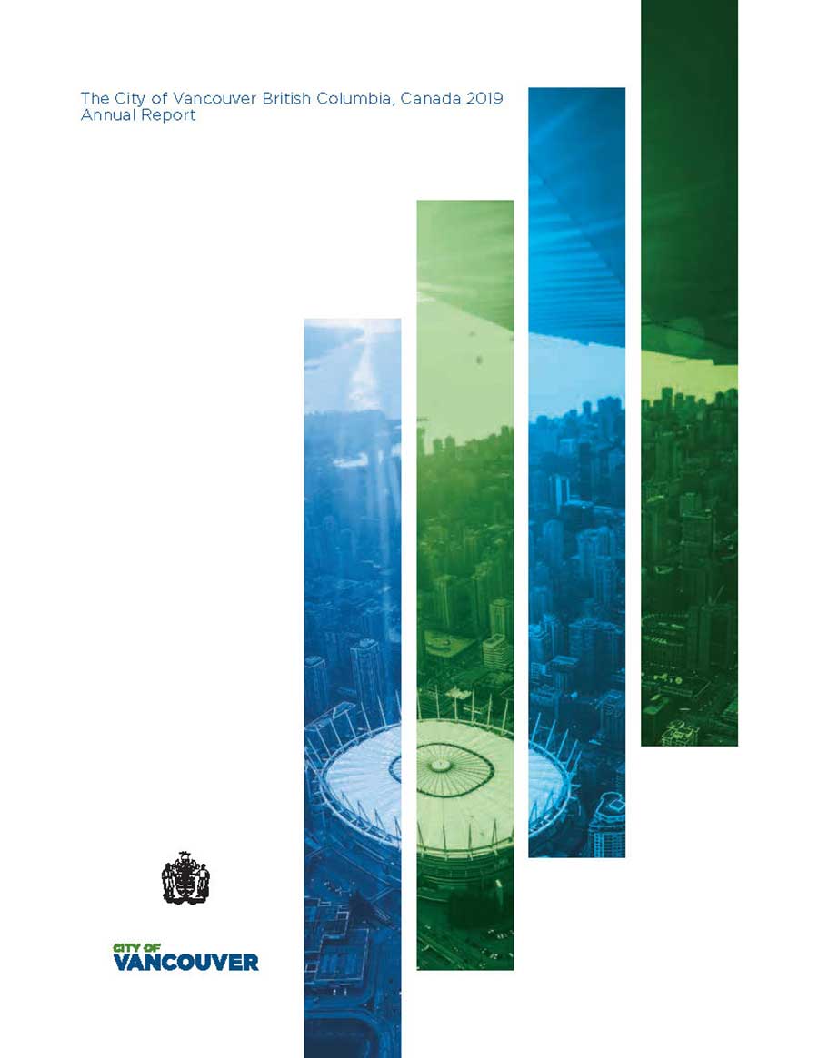
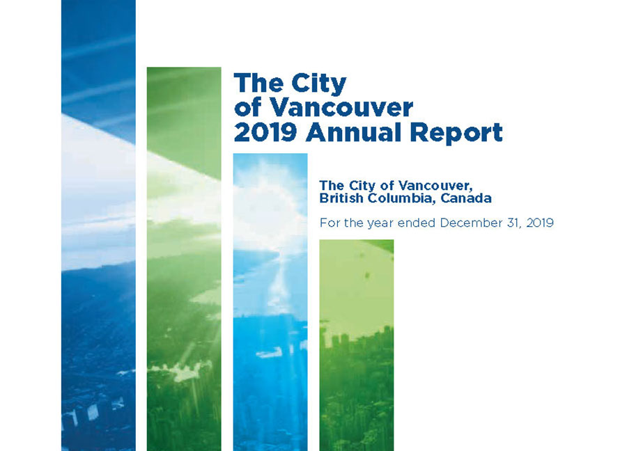
Annual Report Proof Download to view full report.
This was an annual report we made for the city of Vancouver. We were required to include all supplied text, images and diagrams, and make sure the page number was multiples 4, following a grid and using character and paragraph
styles throughout. We also had to follow their style guide. I have selected a few of my favourite pages, but you can download the whole annual report above.
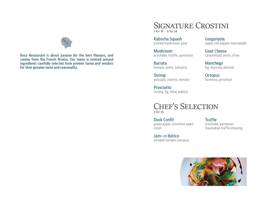
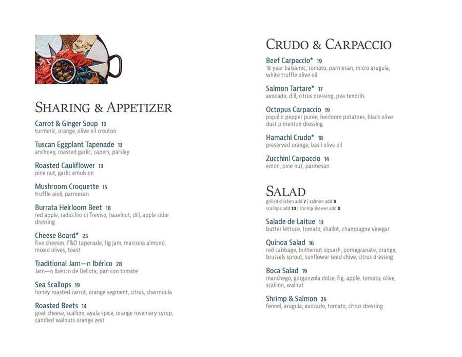
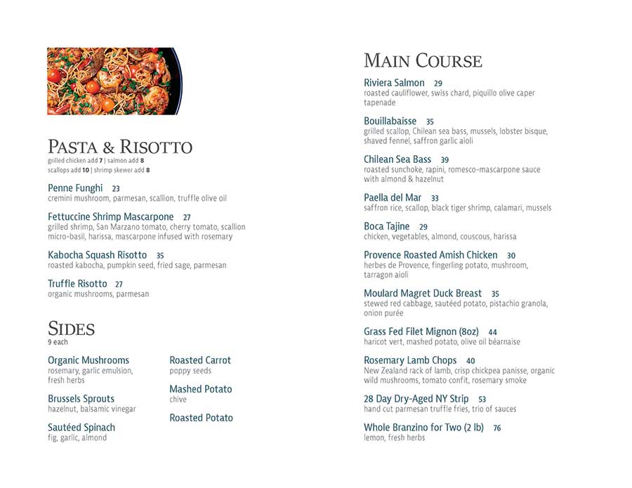


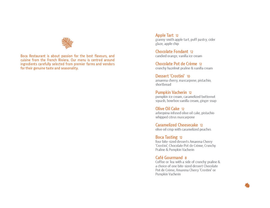
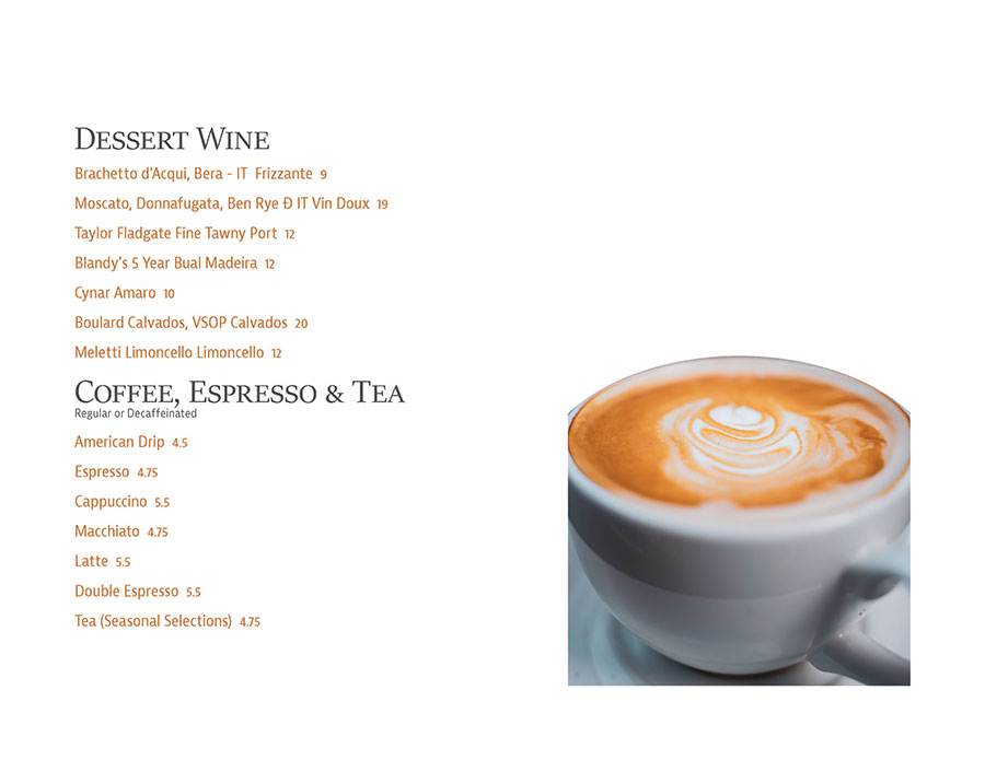

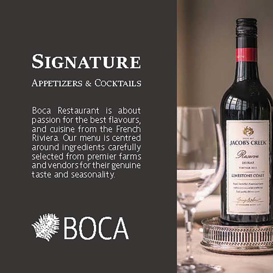
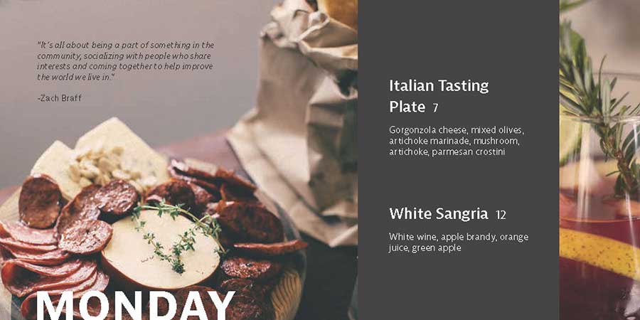
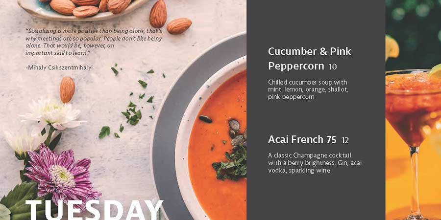
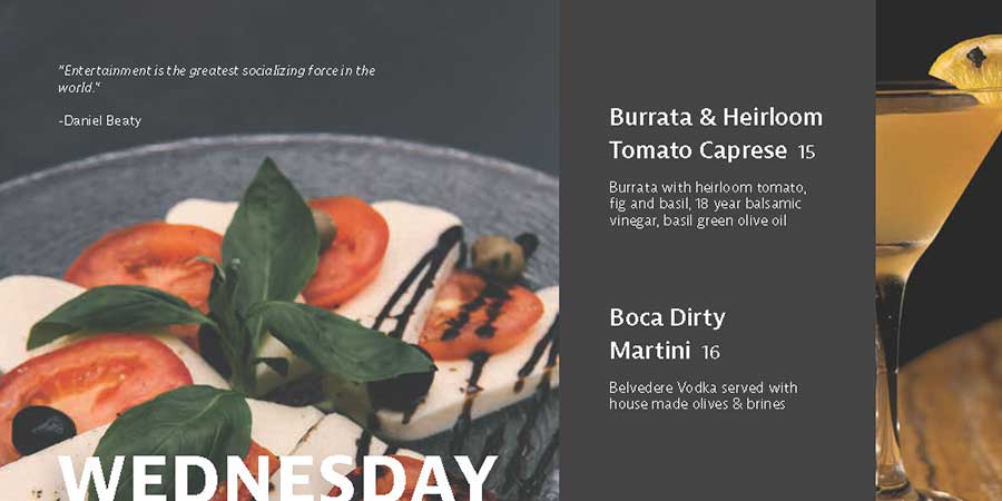
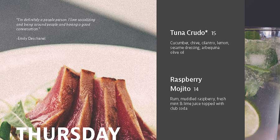
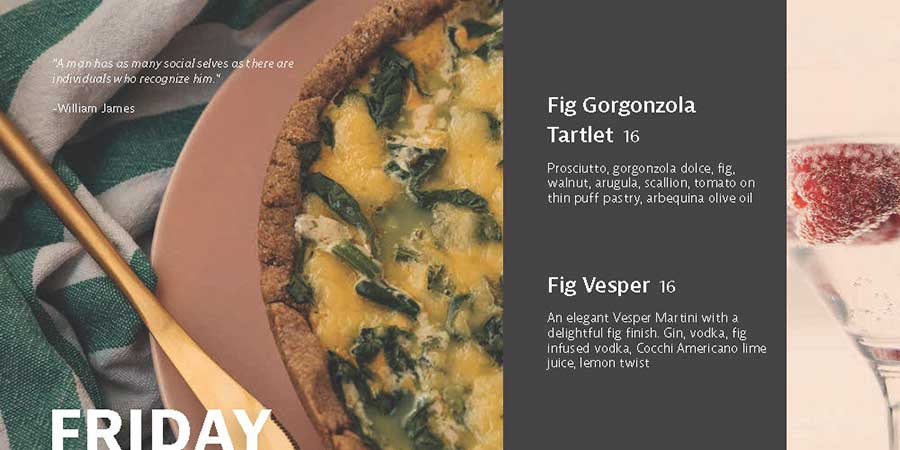
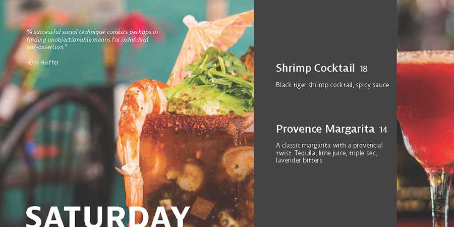
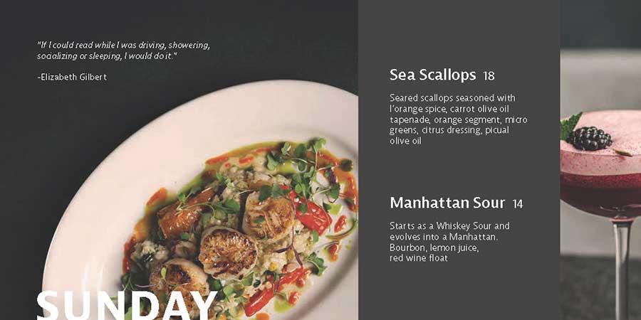
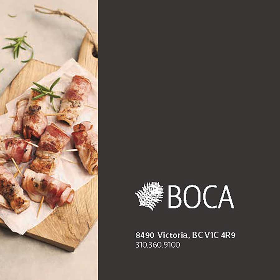
This assignment was completed throughout the whole class. We were given a restaurant to rebrand the following items:
- Logo (CMYK, SPOT, Black, White)
- Dessert and Dinner Menu
- Daily Specials Menu
We had complete creative freedom with a few restrictions, such as no bleed on the dessert and dinner menu and the sizes of the menus.
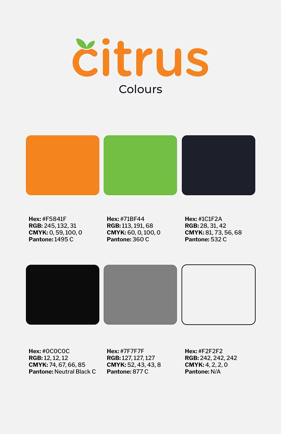
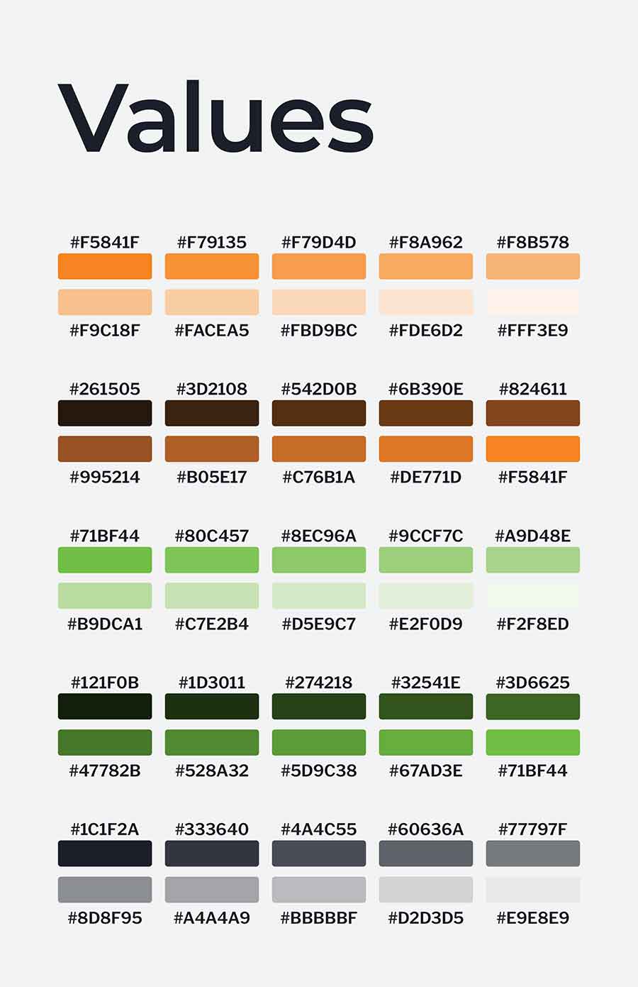
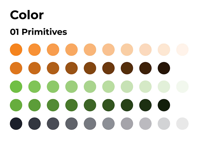
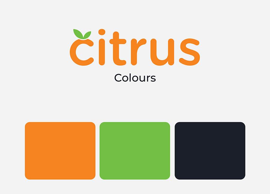
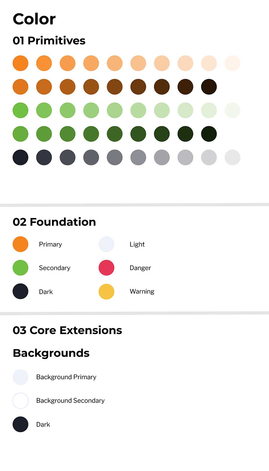
This was one of my first tasks when I started my work placement at Citrus Camps for my Graphic Communications diploma. I had refined their colour palette to make things more unified, removed unnecessary colours in the dark citrus palette, and make the values easier to use by adding the hex codes for all of the colours.
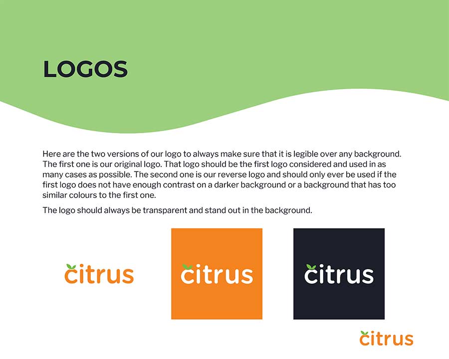
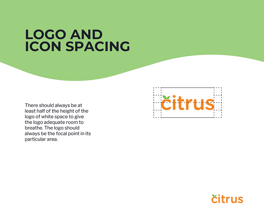
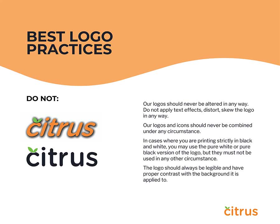
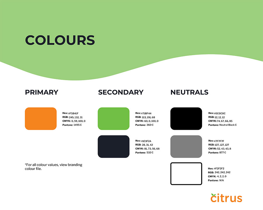
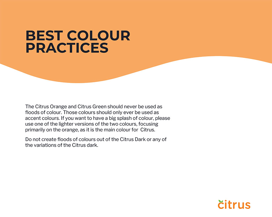
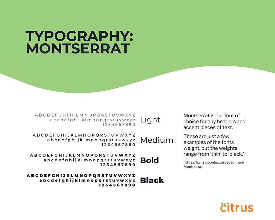
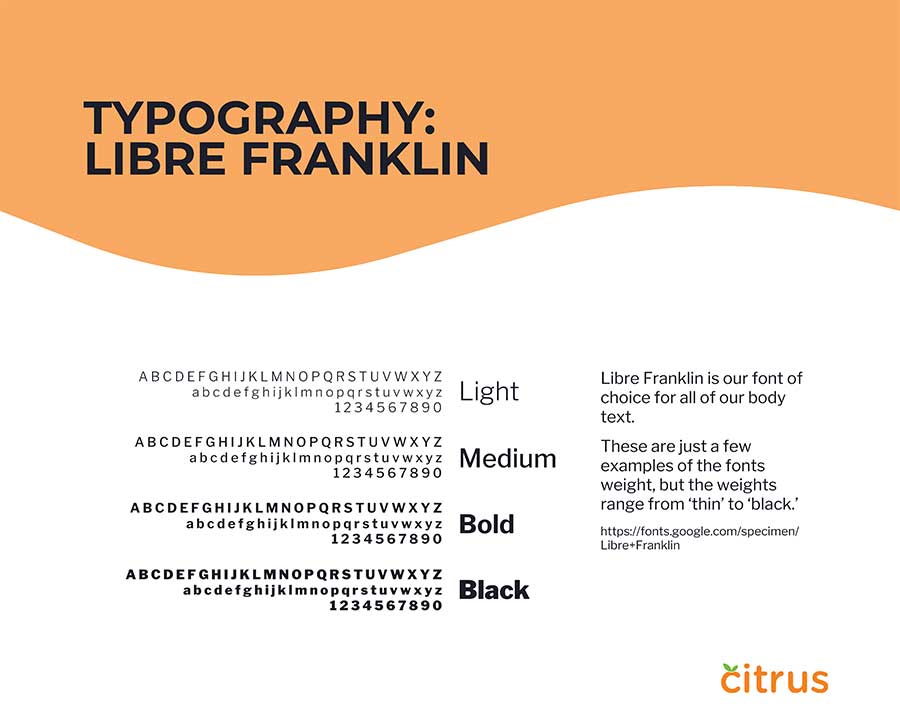
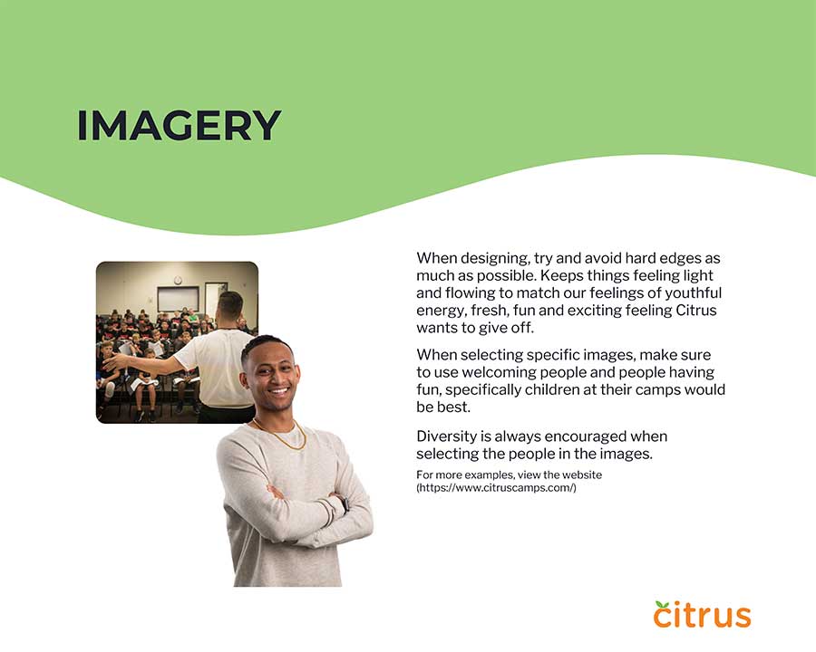
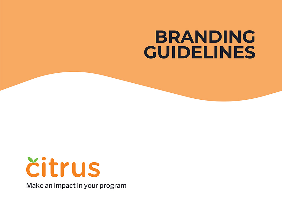
I had created a branding guideline package for Citrus during my work placement for my Graphic Communication diploma. I created all of the pages above, but it is not completed, due to limited time to get the necessary information added. I created the design in Canva, from their request so that they could make edits and add onto it.
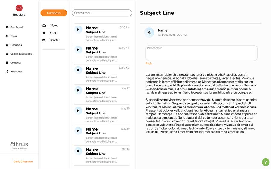
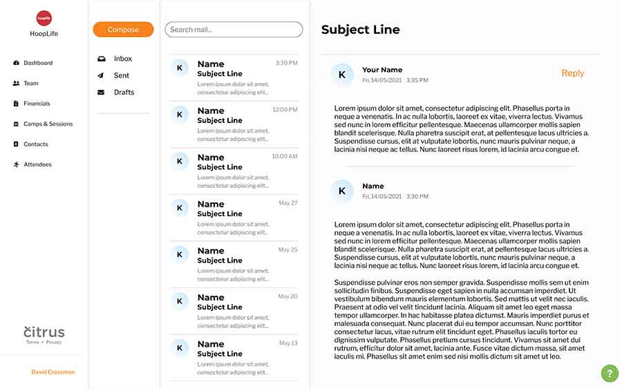
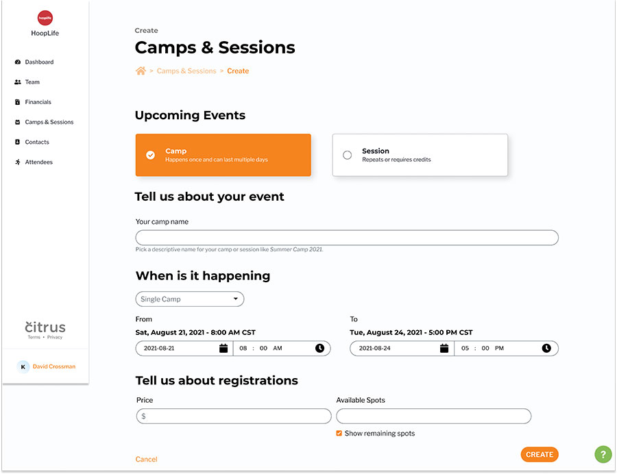
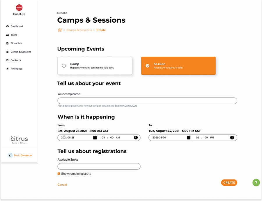
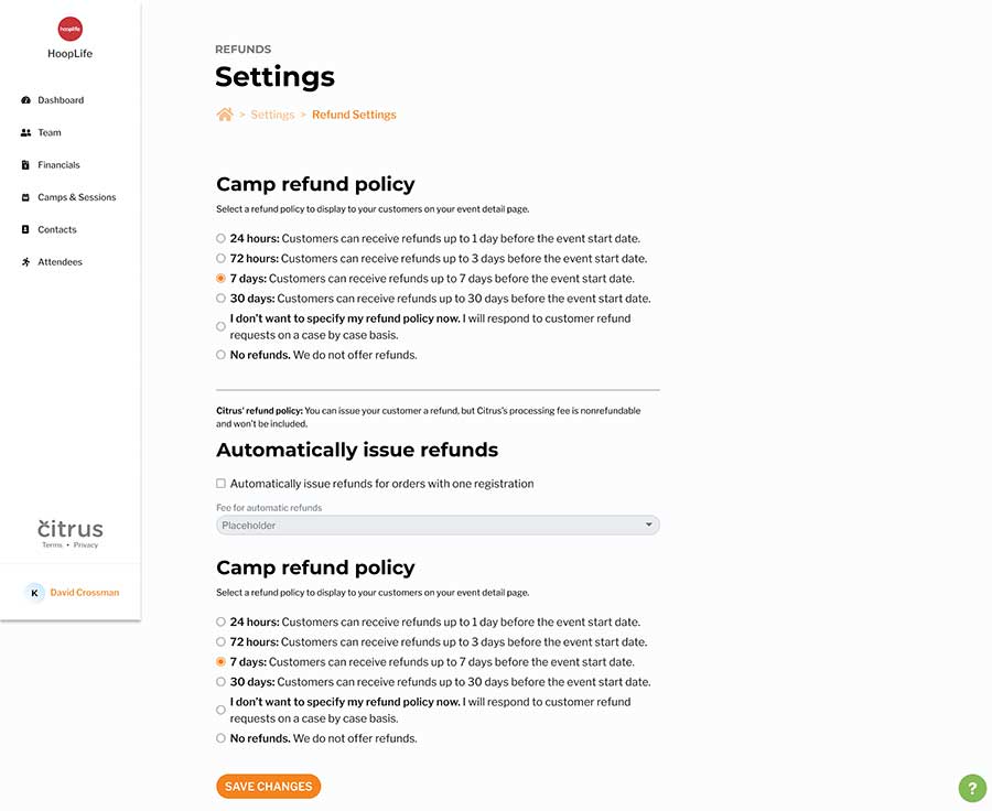
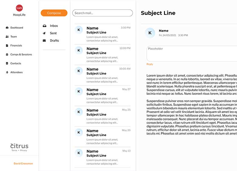
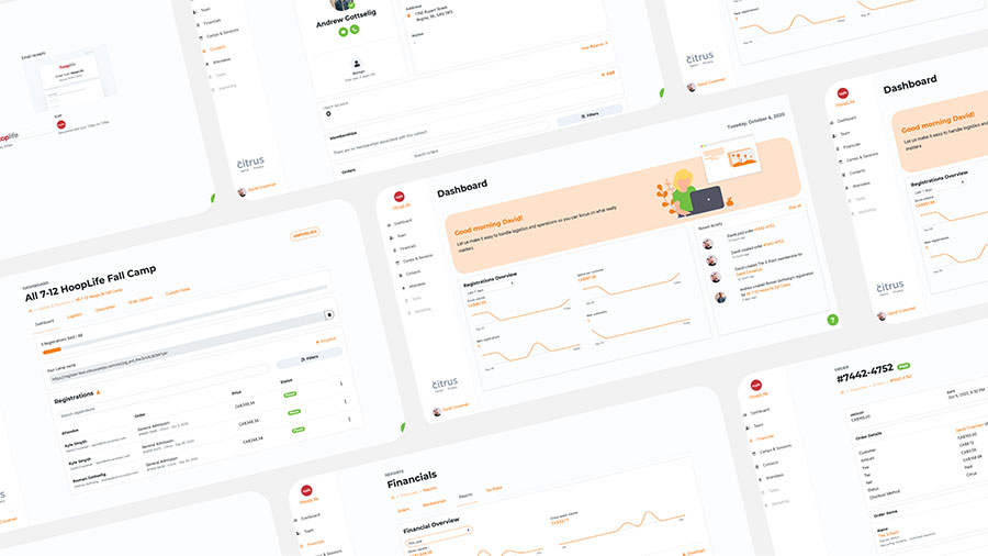
During my time at Citrus for my work placement for my Graphic Communications diploma, I learnt the basics of UI and UX design. I had remade pages from their existing website and I even got a chance to create an inbox concept for them. I have just included a few examples of pages that I recreated.
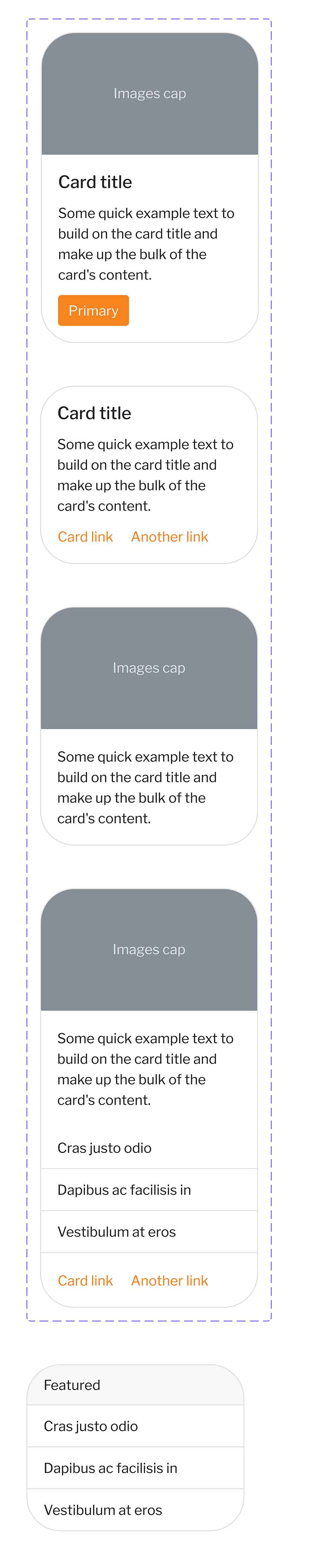
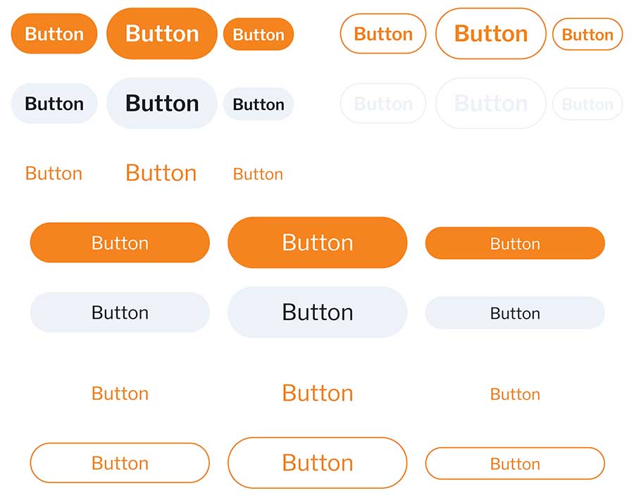
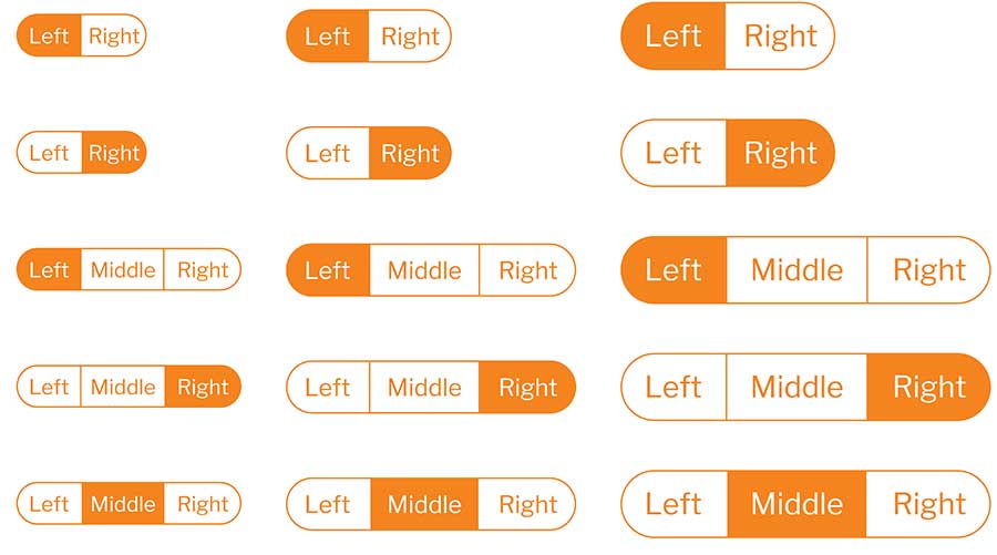
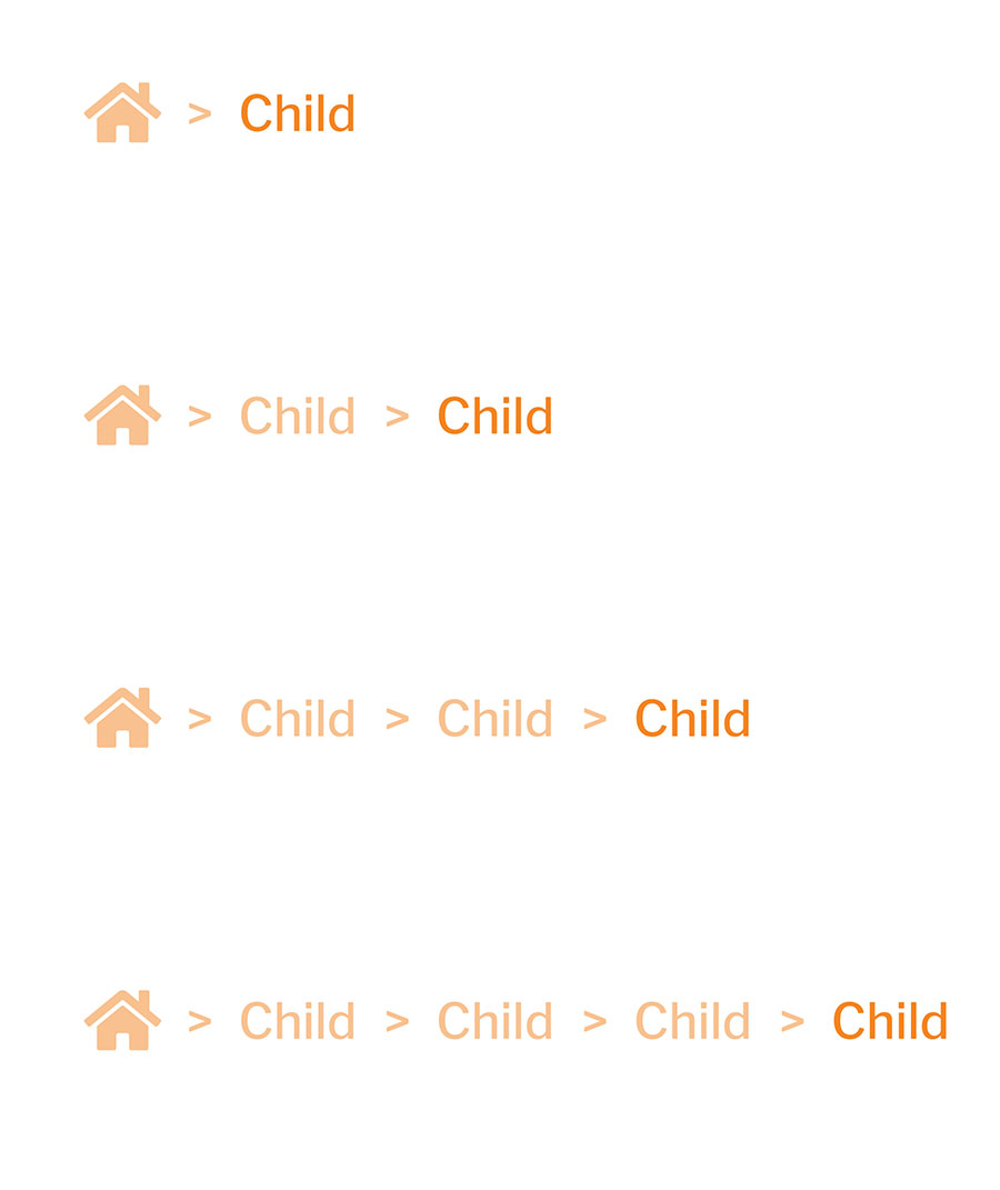
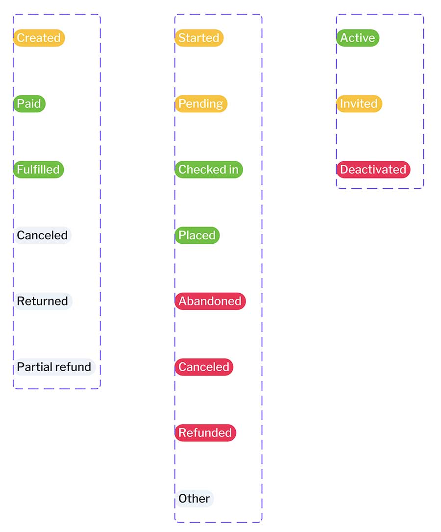
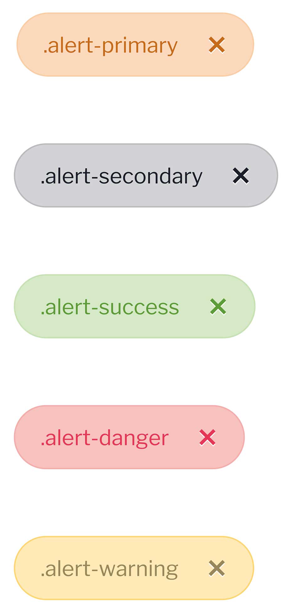
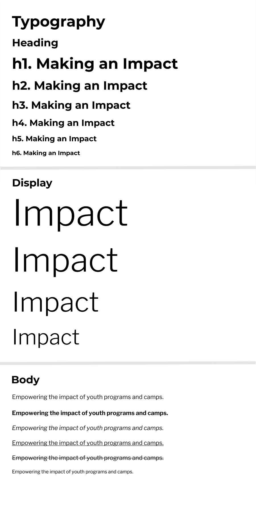
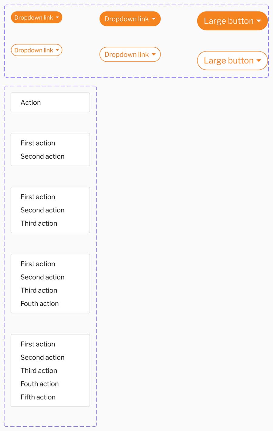
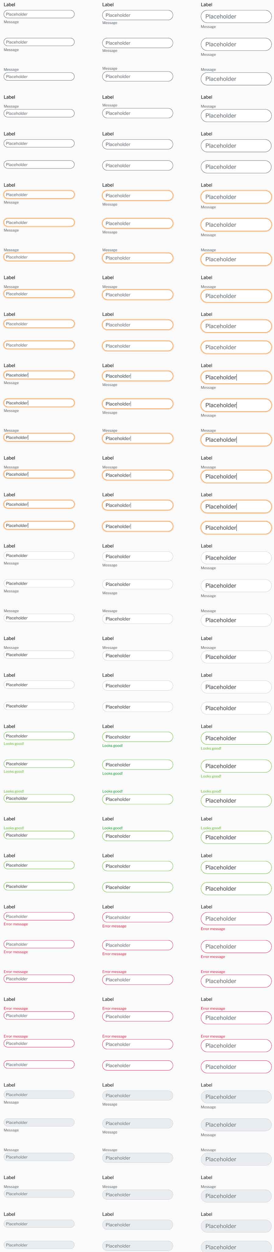
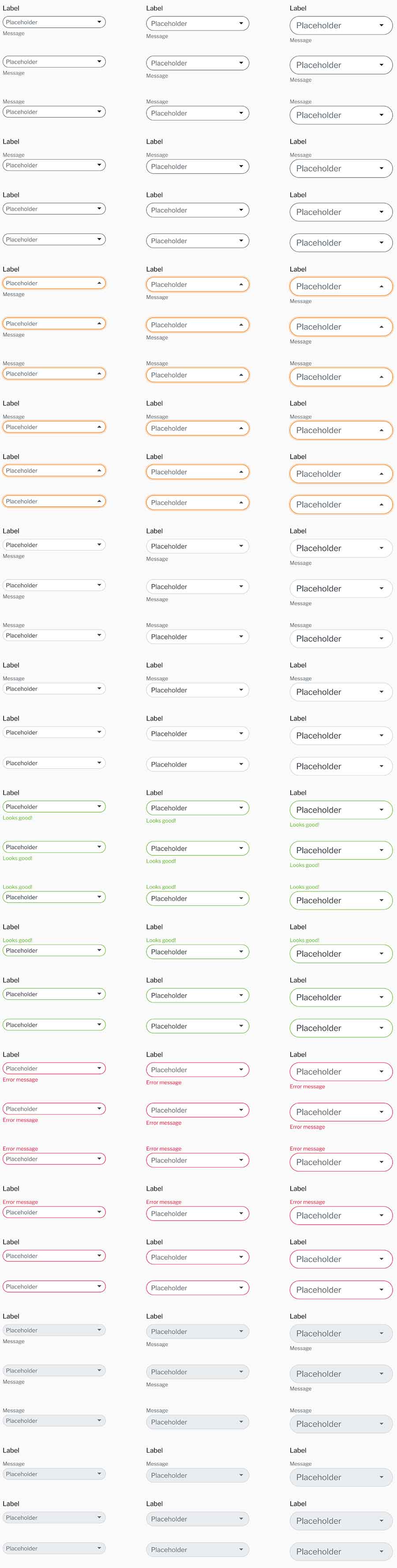
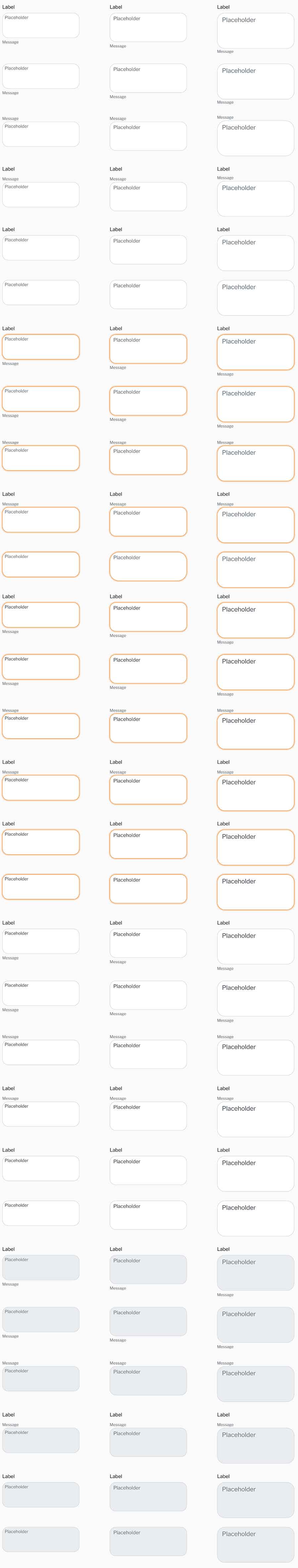
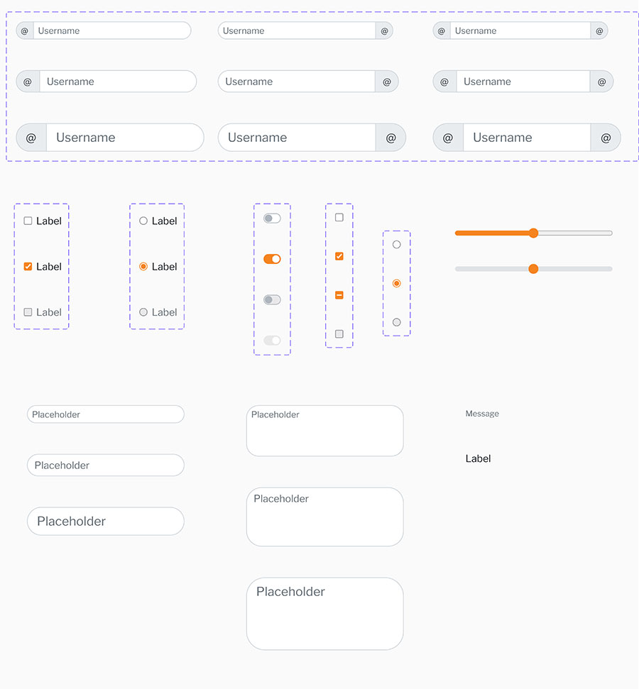
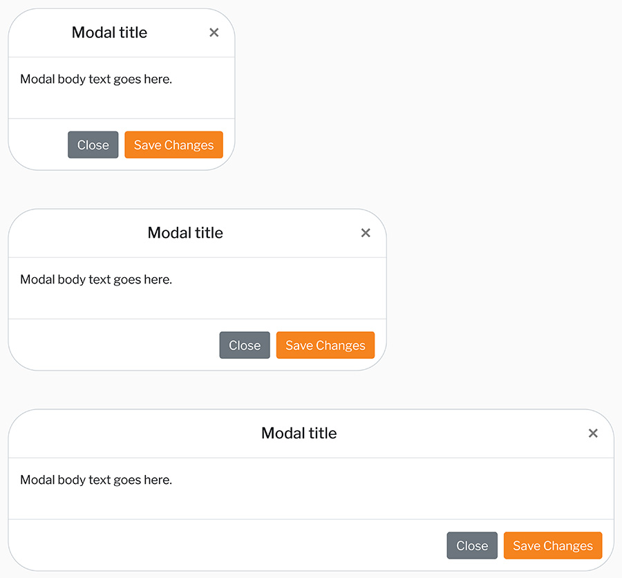
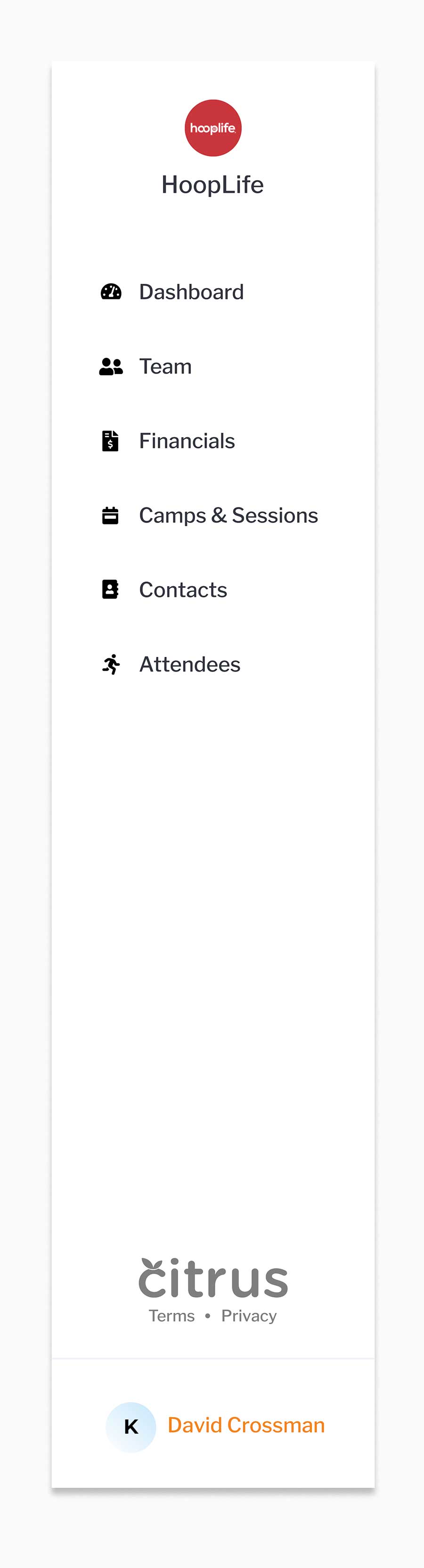
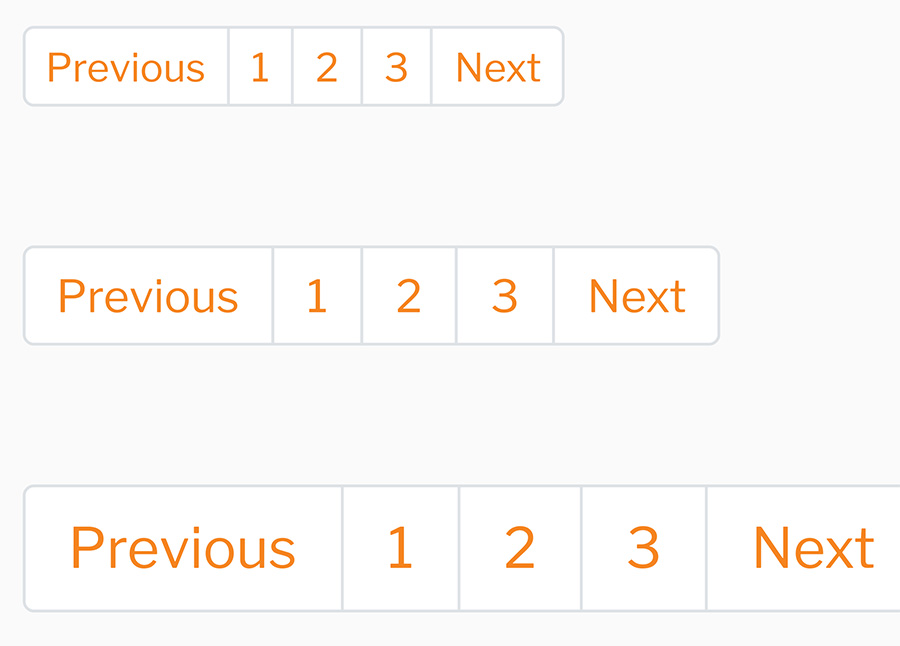
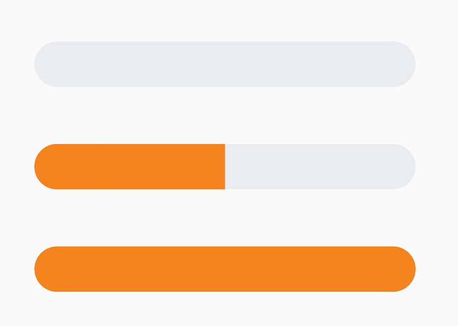
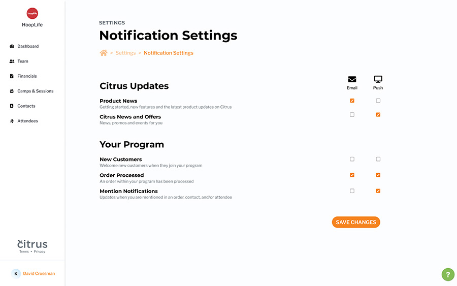
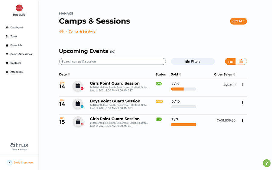
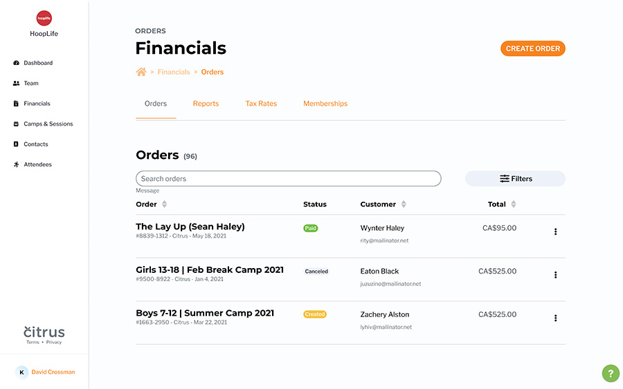
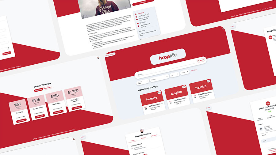
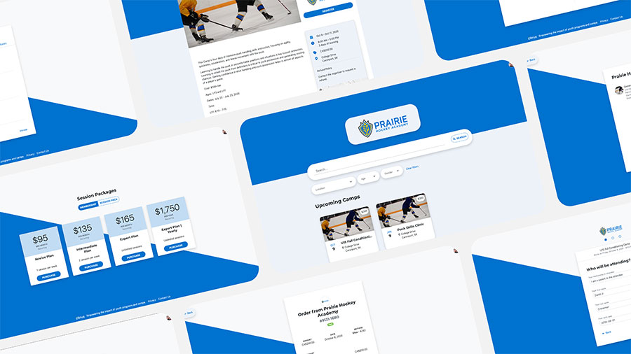
During my time at Citrus for my work placement for my Graphic Communications diploma, I learnt the basics of UI and UX design. I was given the task to modify a bootstrap template in Figma to fit the citrus branding guidelines and the website that they already had created. I redid every piece above and removed anything that was unnecessary for their kit.

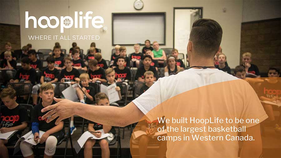
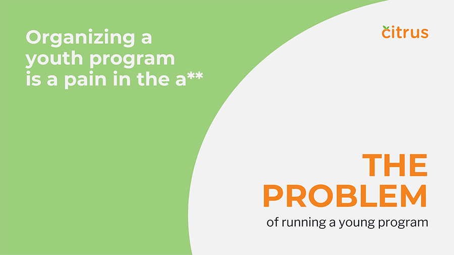
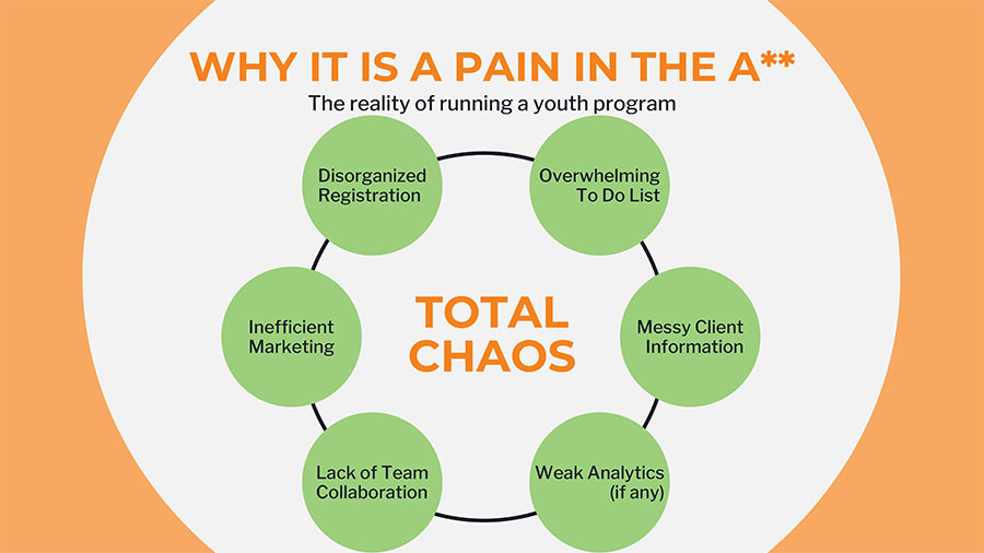
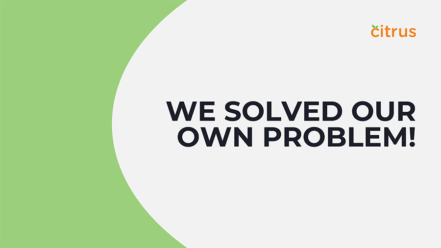
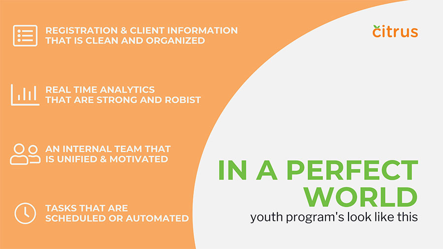
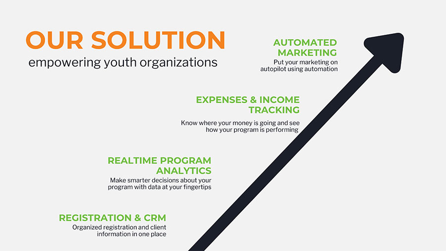
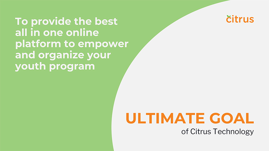
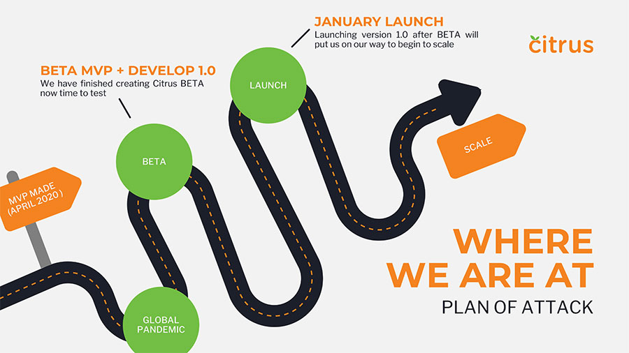
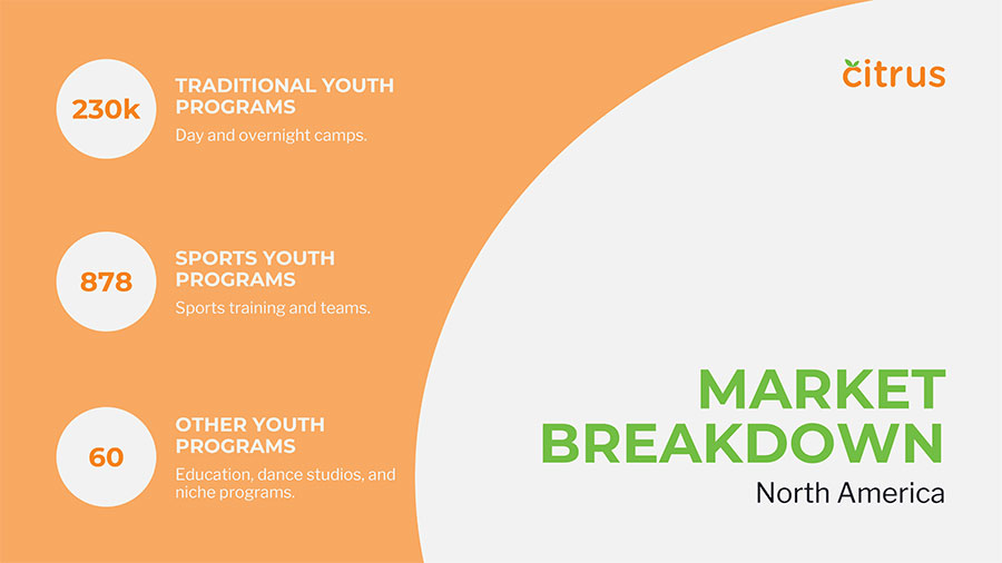
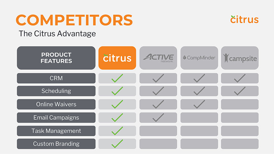
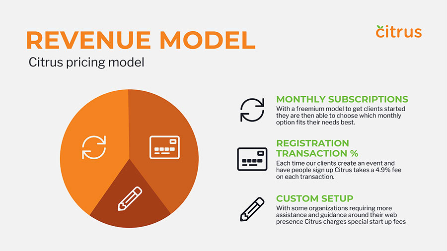

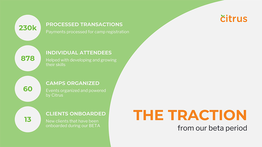
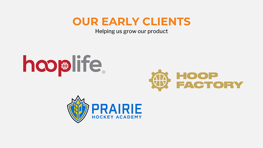
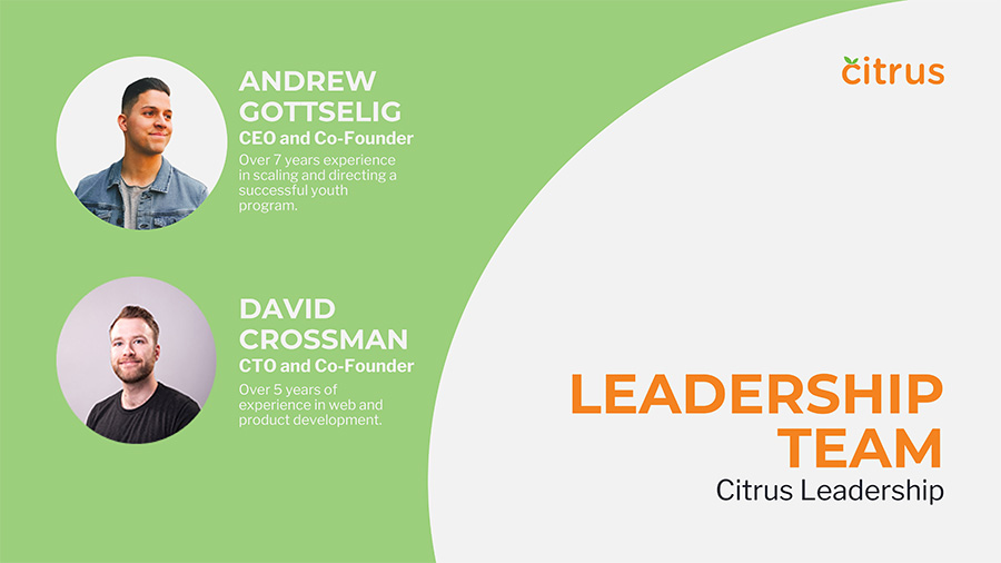
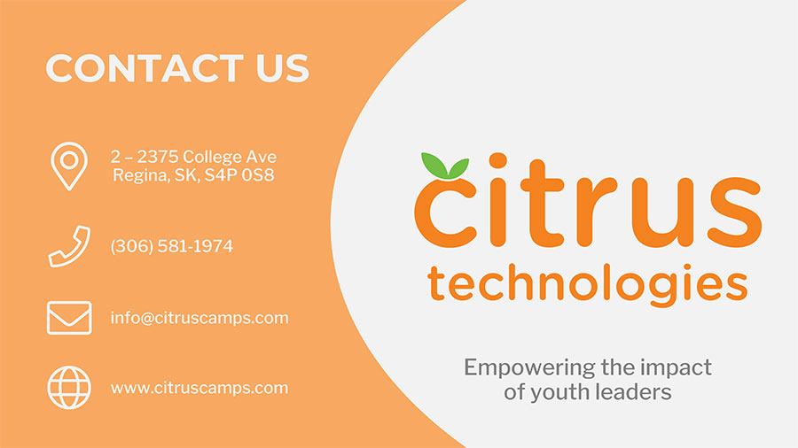
During my time at Citrus for my work placement for my Graphic Communications diploma, I learnt the basics of UI and UX design. I had to recreate their Pitch Deck in Canva, based on their original pitch deck, but more professional and uniformed designs.
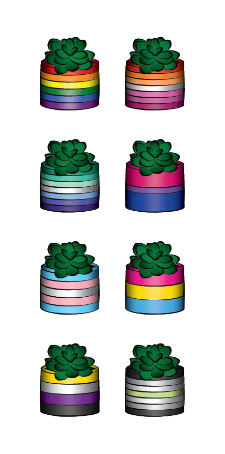
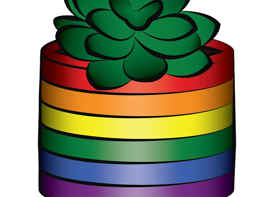
This was a passion project for myself and my friends for LGBTQ+ Pride that I personally printed out stickers for them and myself with out LGBTQ+ Flags (LGBTQ+, Lesbian, Gay, Bisexual, Trangender, Pansexual, Nonbinary and Agender Flags)